This week we ran our second design sprint, with the focus now on ‘subjects’. It was my first experience of a design sprint and it was fascinating to see how the day unfolded and the different ideas that staff and student participants brought to the session.
Problem: ‘How do we better serve users who want subject level information?’
The problem was defined by Steve (Web Design Manager) at the start of sprint. For this purpose our definition of ‘subjects’ was fairly wide, ranging from groupings for taught undergraduate and postgraduate courses to areas of our research activity.
We know that presenting subject information has the potential to help our users in several ways:
- School leavers have a general awareness of the term ‘subjects’ so it could be a more effective way of introducing them to our course offering than using a term such as ‘study’.
- Grouping courses into subject pages might be a way to summarise some of differences between each course.
- Our top tasks research shows that prospective students want to know rankings and awards for subjects presented in a consistent way and in a location that’s easy to navigate to.
- More broadly, subject pages could demonstrate the close links between our teaching and research activities and help audiences such researchers, funders, industry, and other collaborators tap into this potential.
The things we do as a University are increasingly interdisciplinary; research areas like cancer, sustainability, or diabetes can cut across departments and specialisms. New approaches to problems through collaboration and different ways of thinking help us stand out and make some incredible discoveries but it presents some challenges in the way we show this to the world. To show interdisciplinary activity we need to unlock the power of our content; we need to bring it out of silos to develop structure, define standards, relationships and create a more connected publishing model. ‘Subjects’, in this sense, were a good place to start as they seem to touch on so many areas of our activity.
I provided some background evidence from the course finder indicating the search volumes for things which could be considered subjects. Some of these searches led naturally to course pages, for example, the majority of users looking for ‘medicine’ probably just want to get to the Medicine course page. Other searches, for example – ‘business’, don’t always align with a single course page so easily because we provide multiple options in this area.
Top searches for subject related content, Jan 2017 – Jan 2018
| Search term | Number of searches |
|---|---|
| Languages | 84,108 |
| Law | 31,864 |
| Medicine | 20,587 |
| Psychology | 20,552 |
| Business | 12,672 |
| Engineering | 9,900 |
| Dentistry | 9,498 |
| English | 8,418 |
Content requirements
The sprint participants then brainstormed the types of content that might be needed to show subject information to different audiences. We had some great suggestions from this exercise. Most thought it would be good to show things like courses, employability statistics, key staff in different research areas, subject rankings/awards, and contact information. Others felt conveying a sense of the student voice and links to student support were important.
There’s a need to strike a balance between the different types of content on these pages. At one end of the spectrum there’s content that pulls the user in like course lists and staff contacts; generally this is the stuff that users are actively seeking out. At the other end there’s ‘push’ content; these are the messages that the University wants to shout about, for example subject awards or evidence of research impact.
Evidently there was a desire to add lots of content to the page, however in doing this we ran the risk of diluting its focus and purpose. We also needed to be mindful of the challenges of serving multiple audiences (prospective UG and PG students, researchers, industry, collaborators etc.) in one space.
One or two of the participants raised the prospect of personalising content according to user interest. This would certainly increase the relevance of the content and is something that we would like to do as we move towards the full implementation of a new content management system.
Understanding the user journey
Rob (UX Manager) then spent some time talking about user journeys covering topics like entry and exit points, target paths and key touch points. There was a feeling that subject pages could, amongst other things, act as landing pages and make a more cohesive user journey to course, research and staff pages.
Sketching ideas
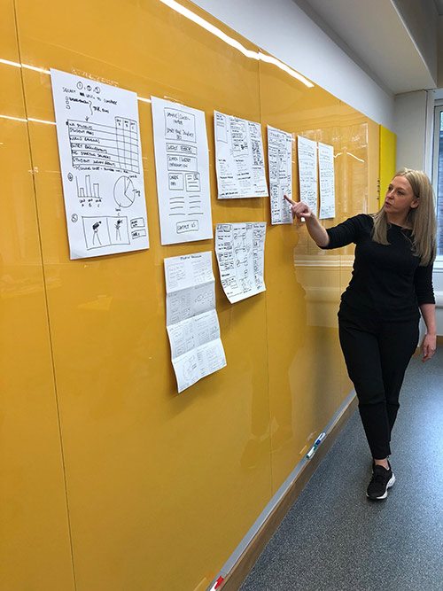
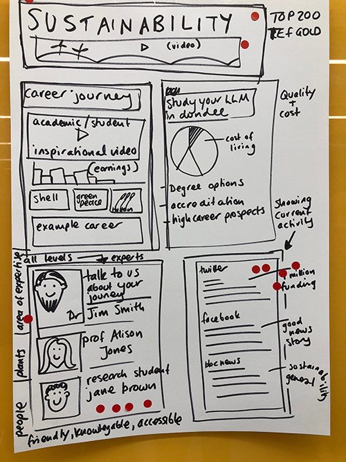
The last part of the day allowed people to get creative and sketch out different ideas for how a page might look. Working in groups, the participants covered subjects including ‘sustainability’, ‘medical education’, ‘cancer research’ and ‘computing’. Artistic flair isn’t always everyone’s forte but that doesn’t really matter, it’s the ideas and the ensuing discussion that counts.
Ideas that were given greater detail in this part of the process included a map for demonstrating the global impact of research and a ‘trending’ section that could link to external websites where our research has picked up media attention.
The group then voted for their favourite elements of each design whilst Steve, Rob and I discussed the various options and the feasibility of each. You can see some of the ideas below.
Conclusion
The success of the design sprint has been reflected in some the great ideas that were presented and the positive feedback we received from the participants. Steve spent the next day designing the prototype which will now be tested with users.
For me, with my content head on, the next part of the job will be to use everything we’ve learnt and the feedback from the prototype as the starting point for a content model. Subject pages should be a great example of the power of connected content; elements such as people, projects, awards and facilities will exist as pieces of a bigger jigsaw. The beauty of this approach is that once you break content into its smallest pieces and understand the relationships between it you have the power to mix, match and publish it in different ways – and that’s a pretty exciting prospect.
You can view the resulting prototype and associated rationale below.
Did you attend the sprint? Thank you!
A huge thank you to all of the attendees of our second Design Sprint. We really do appreciate your time and input.
We took photos of all of the notes and sketches generated on the day. The ideas have been recorded and will have a big influence on the final solution that we will build later in the year. Some ideas can be implemented as part of the new website launch, some will require more thought and future development time. As we said on the day, weird, impossible, and impractical ideas often give way to truly inspired ones!
Couldn’t make it? Join another Design Sprint to share your ideas
With a more traditional ‘design, build, and launch’ approach, people don’t get a chance to contribute their ideas until the website is almost finished, when the design process is complete and the site has been developed. At that stage, it’s simply too late to properly react to great ideas and detailed feedback
We ask everyone reading this to take part in a sprint (there are lots more coming up) to help shape future website experiences for students, staff (and yourself!). If you can’t make it to a sprint, please tell everyone you work with what we are doing.
Book your place at a design sprint
13 Mar: Course pages
27 Mar: Schools
10 Apr: Events – University and The Union
24 Apr: Staff induction
08 May: Compare courses
22 May: Apps – Student and Staff dashboards
05 Jun: Accommodation
19 Jun: Country pages
03 Jul: Graduation
17 Jul: Professional services
31 Jul: Appointment booking
14 Aug: Jobs
28 Aug: Open Days
11 Sep: Room booking / catering booking
25 Sep: Opening hours / building information
09 Oct: Search – main search, scholarship search, internship search, placement search
23 Oct: Research pages
06 Nov: Location / Dundee City / Scotland
20 Nov: Homepage
04 Dec: Clearing
18 Dec: Chat bots / chat UI


