Not sure what a Design Sprint is? These are fun, interactive problem-solving sessions with students, staff, and other key audience members. For more information, read Join a Design Sprint to shape future website experiences
Our fifth Design Sprint took place on 10 April 2018. The problem we came together to solve was: ‘What information should a country page provide to meet the needs of the audience?’
Morning, day 1: reviewing the problem together
The first part of the Design Sprint saw Rob and I presenting some background information about the problem.
We started with discussing why the country pages were a challenge.
- Evidence of user frustration/confusion
- Disjointed user experience
- New website!
We then discussed the user stories that have been identified and voted on by applicants, these included:
- Find details for students from a specific country
- Check entry requirements for a course
- Check English language entry requirements
- Find out about English language courses
- Find out how many students are studying a course and from which countries
Evidence of user frustration
We ran a survey across all of the country pages on the website, asking, “Did you find what you were looking for?” The results gave us a clear indication that visitors are frustrated with the current experience and are not finding the information they’re looking for.
There was a high demand for entry requirements and similar information for applicants:
Defining content requirements
After discussing the problem, we moved on to discuss the traditional approach to web content.
- Content is an afterthought
- No appreciation of user needs
- No understanding of the user journey or context
- An assumption that print content is fine for web
- Badly written and off-brand
- No understanding of the connections between different types of content
- Content creation is expensive, disruptive and inefficient
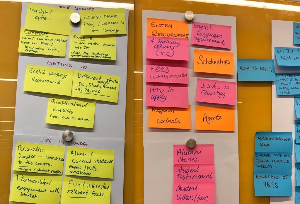
We then handed over to our participants to ask them to define the content requirements for this challenge.
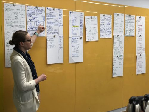
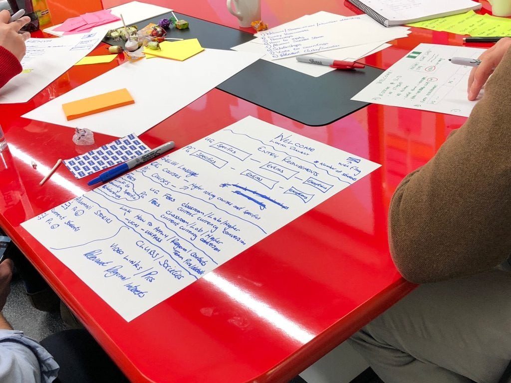
Photos: Coming up with content requirements for country pages
Problem and content discussion
Before we thought about solutions, we asked the participants “do we fully understand the problem?”
What information should a country page communicate?
- Thoughts from post-it notes about the lightning talks
- Existing country pages experience
- User research
- What is your experience of the problem?
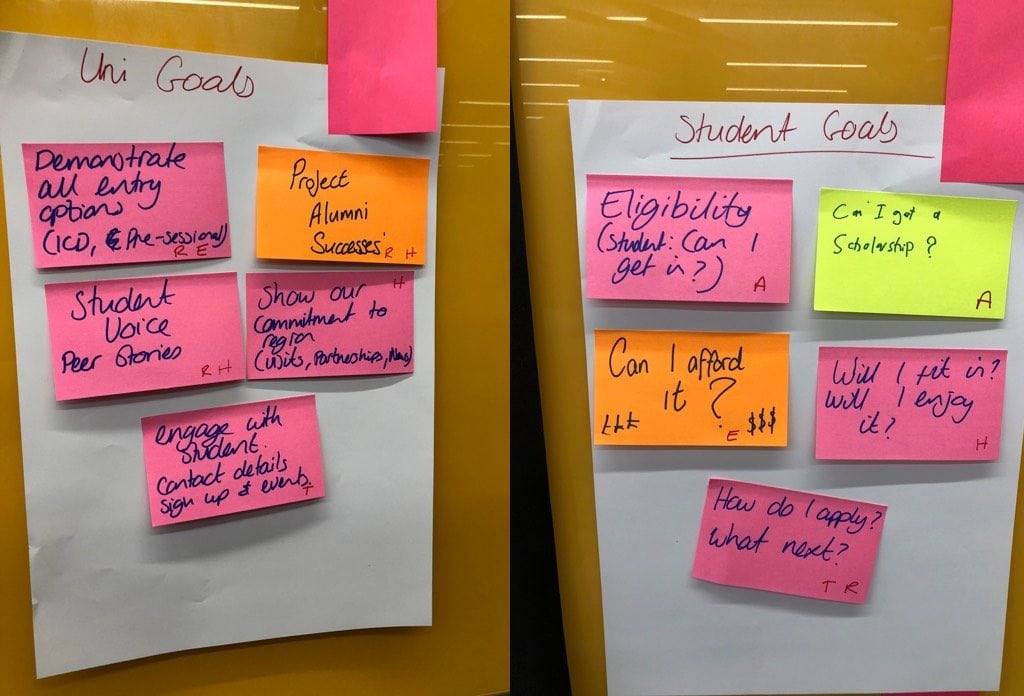
Goal setting
We set goals for what we would create in the afternoon. Setting goals for our solution helps to guide our ideas so we achieve something that is:
- realistic
- purposeful
- useful
Photos: Examples of goals created by participants
Afternoon, day 1: brainstorming a solution
After the free lunch, we allowed some time for people to collect their ideas and understanding from the morning session before moving on to the sketching.
Crazy 8s
Now it was time to move onto the first bit of sketching for the day.
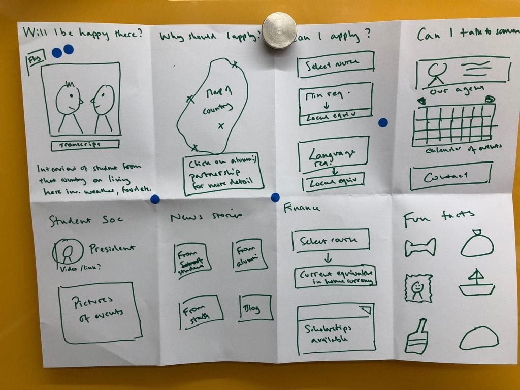
The participants fold a sheet of A3 paper into eight rectangles. They then sketch an idea in each rectangle or sketch a journey.
Here’s the guidance we give to participants:
- Go for quantity, don’t worry about detail or making these beautiful, just try to get your idea across
- Focus on the core elements or just part of the page
- Weird, impossible, and impractical ideas often give way to truly inspired ones
Eight ideas in eight mins. GO!
Photos: Crazy 8 sketches created by participants
Voting
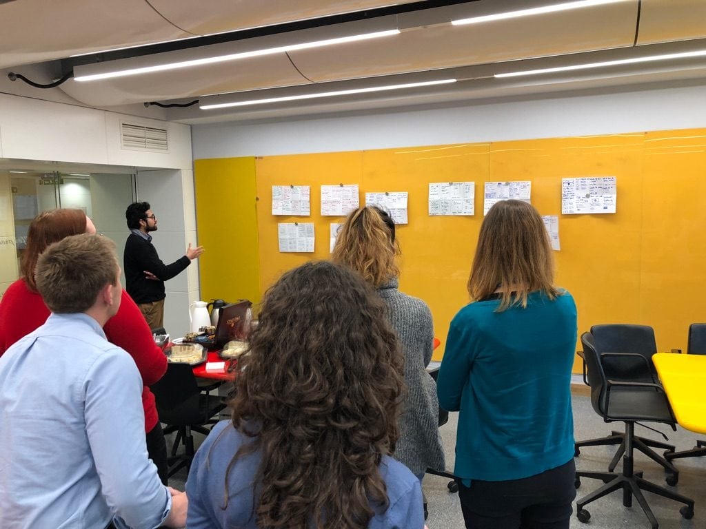
Once the participants had completed their eight sketches, we asked each person to present their ideas and then each person voted on their favourite ideas.
Photo: Presenting Crazy 8 ideas
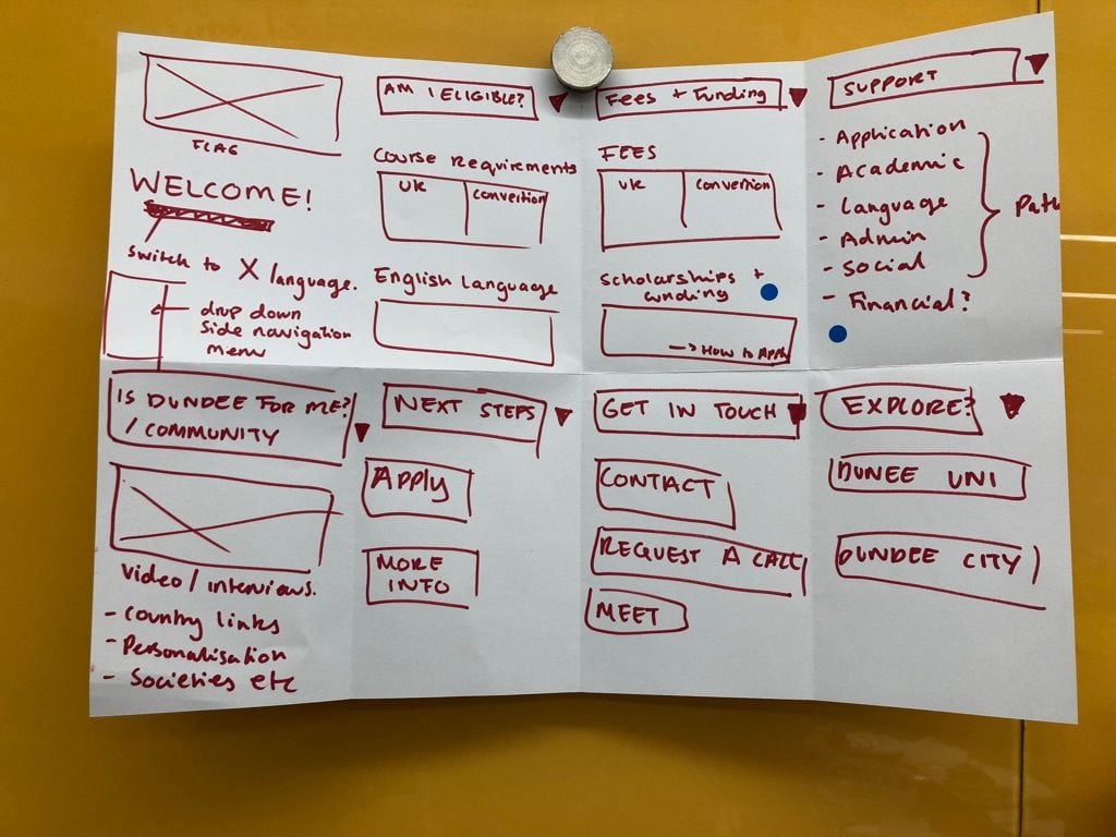
Solution sketches
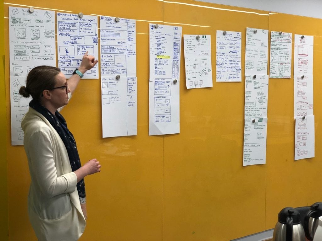
After doing the Crazy 8s and voting, the participants were then given 30 mins to draw a solution taking inspiration from the ideas from the Crazy 8s and what had been voted on.
Photo: Creating and presenting solution sketches
Day 2: prototyping a solution
To test the ideas from the voted solutions, we designed a prototype. Whilst this is not the final design, it allows us to share the prototype for testing and comment from the wider community.
View the full prototype and give feedback
Please take a look at the country page prototype and add your comments (keeping in mind the problem we are trying to solve). This prototype has interactive areas that you can click on to see other pages and tips.
Country page prototype
Next step: Testing the prototype
In addition to gathering feedback via the comments on the prototype itself, the solution will be tested with staff and students in the next week.
Did you attend the Design Sprint? Thank you!
We’d like to thank everyone that took a day out of their schedule to join us on the journey to a new country page experience.
There were great ideas and discussions throughout the day. Some great ideas, unfortunately, didn’t make it into the prototype, but we have notes and photos of everything which will feed into the design process in the future.
Didn’t make the Design Sprint?
Don’t worry we have Design Sprints booked every two weeks on Tuesday for the whole of 2018.
A day may seem like a lot of time to commit, but when you consider that our website has over 3.5M visitors annually from every country in the world then it’s vitally important that we get this right. We can’t do that without engagement from the University community so anything you can do to either get involved or encourage others to get involved, would be much appreciated!
Please see the list below and book a place on a Design Sprint or two that interests you.
[tribe_events view=”list”]
