Our seventh Design Sprint took place on 8th May 2018. The problem we came together to solve was: “As a potential student I would like to compare two or more courses”.
Day 1, Morning : reviewing the problem together
The first part of the Design Sprint saw Steve and Rob presenting some background information about the problem. Course comparison tools are becoming popular on the web and help a potential student make a more informed decision. This is due to the fact the tools allow them to show courses side by side on a single screen without the hassle of going through different prospectuses etc.
To start with we need to think about the potential users that will use the course comparison —
- One audience or many?
- Do they have different behaviors?
- Can we pick a “primary audience”?
And also about the end-to-end user experience —
- How do users arrive or begin?
- What are the entry points?
- What is the ideal or target path or flow?
- What are the key moments or touchpoints
- along the way?
- Is this a single or multi session experience?
- how does the experience end?
- what are the exit points?
We reviewed several course comparison tools online and could see that most did not offer a great deal of customisation to compare on and most were difficult to read once the user had entered their criteria.
Defining content requirements
This was a challenging part of the morning as the vast amount of information associated with courses can be very confusing to a user, allowing a user to choose what they want to see and compare upon will hopefully set us apart from other universities. Some of the potential criteria a user can choose is shown below in the pink coloured post-it notes —
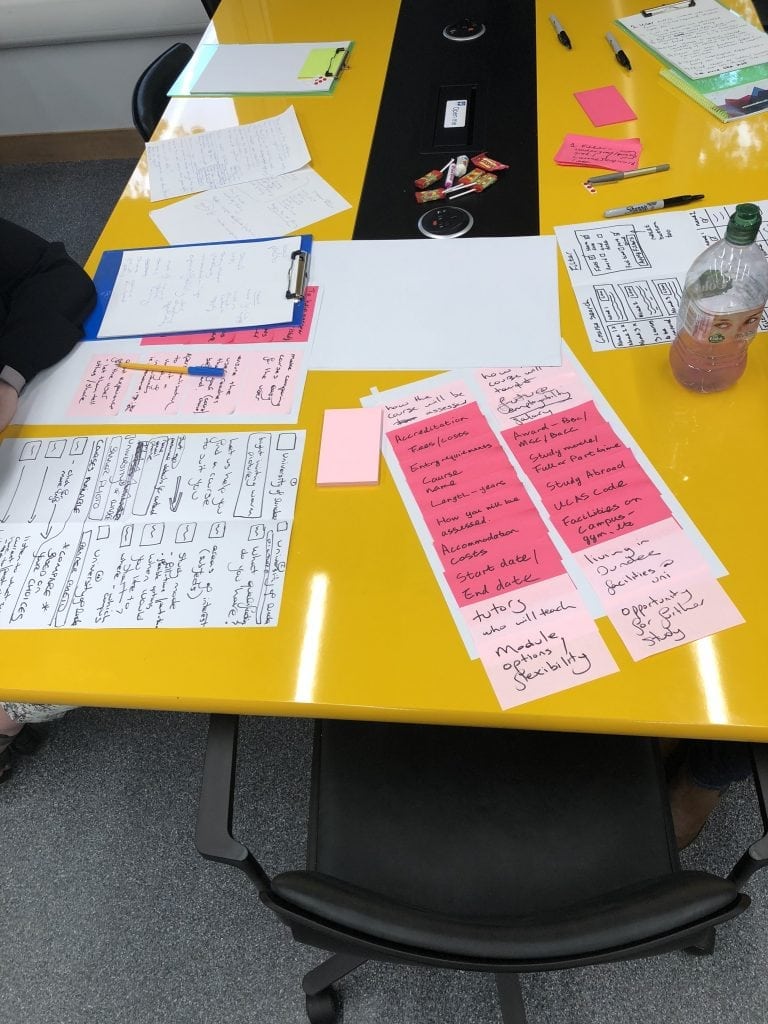
Problem, content discussion and goal setting
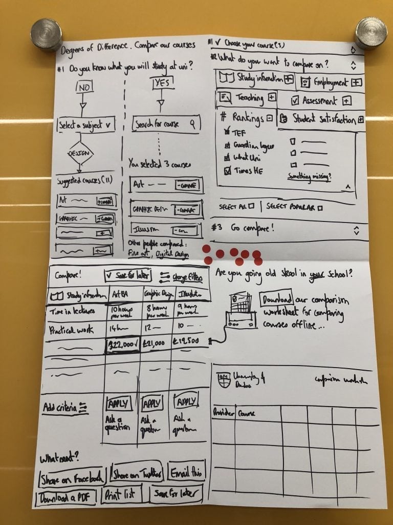
The vast amount of information that was going to be on show was discussed and how this was best presented to the user once they had entered their criteria. All agreed like the examples shown earlier in the morning that a table format with relative headings would be best for this. Also discussed was the ability to compare 2-4 courses maximum as more than 4 would present far too much information to a user at the one time.
Day 1, Afternoon : brainstorming a solution
After the free lunch, we allowed some time for people to collect their ideas and understanding from the morning session before moving on to the sketching.
Crazy 8s
Now it was time to move onto the first bit of sketching for the day.
The participants fold a sheet of A3 paper into eight rectangles. They then sketch an idea in each rectangle or sketch a journey.
Here’s the guidance we give to participants:
- Go for quantity, don’t worry about detail or making these beautiful, just try to get your idea across
- Focus on the core elements or just part of the page
- Weird, impossible, and impractical ideas often give way to truly inspired ones
Examples of the Crazy 8s can be found below —
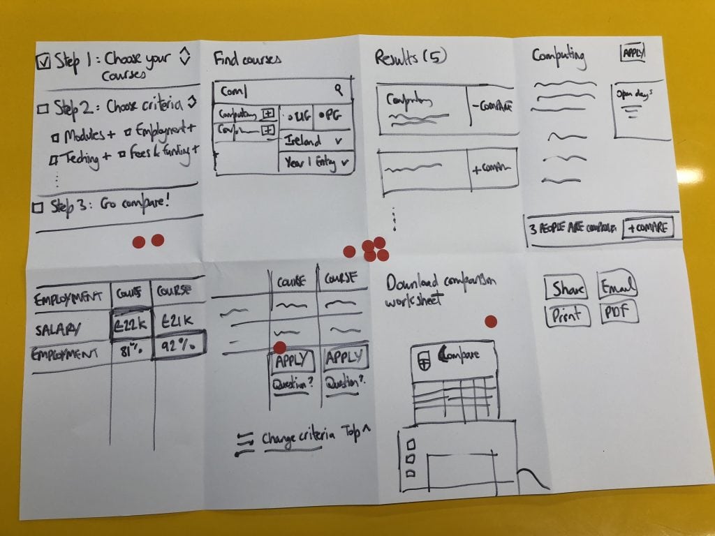
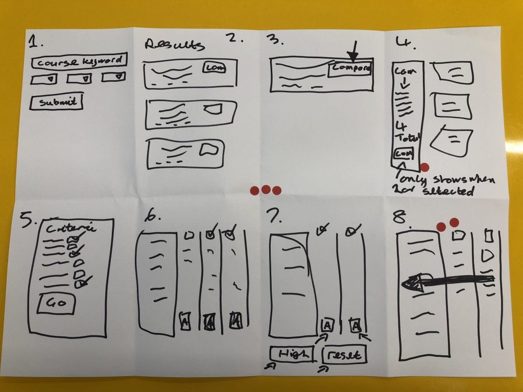
Solution sketches
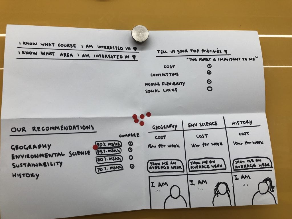
After doing the Crazy 8s and voting, the participants were then given 30 mins to draw a solution taking inspiration from the ideas from the Crazy 8s and what had been voted on (represented by the stick on red dots in the photos).
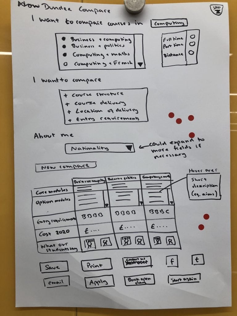
Day 2: prototyping a solution
To test the ideas from the voted solutions, we designed a prototype. Whilst this is not the final design, it allows us to share the prototype for testing and comment from the wider community.
View the full prototype and give feedback
Please take a look at the country page prototype and add your comments (keeping in mind the problem we are trying to solve). This prototype has interactive areas that you can click on to see other pages and tips.
Course comparison prototype
Next step: Testing the prototype
In addition to gathering feedback via the comments on the prototype itself, the solution will be tested with staff and students in the next week.
Did you attend the Design Sprint? Thank you!
We’d like to thank everyone that took a day out of their schedule to join us on the journey to a new country page experience.
There were great ideas and discussions throughout the day. Some great ideas, unfortunately, didn’t make it into the prototype, but we have notes and photos of everything which will feed into the design process in the future.
Didn’t make the Design Sprint?
Don’t worry we have Design Sprints booked every two weeks on Tuesday for the whole of 2018.
A day may seem like a lot of time to commit, but when you consider that our website has over 3.5M visitors annually from every country in the world then it’s vitally important that we get this right. We can’t do that without engagement from the University community so anything you can do to either get involved or encourage others to get involved, would be much appreciated!
Please see the list below and book a place on a Design Sprint or two that interests you.