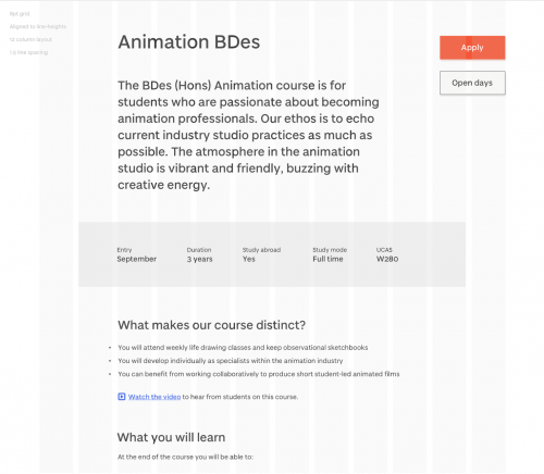
What is a grid system?
a structure comprising a series of horizontal and vertical lines, used to arrange content
Nearly all sites these days are designed upon a grid system for laying out elements on the page. It allows us as designers to provide a system that can work with a solid structure and present content and imagery in a much more readable, manageable way. Grid systems have always been used in the printing industry as standard but their transition into web design has allowed web designers to achieve a level of consistency which would otherwise be difficult to achieve.
The grid system will inevitability be invisible to the end user but it will allow for a site that users will find easy to navigate, read and understand. This is very important as a lack of alignment of elements is very noticeable and creates a sloppy impression. This might very well result in a lack of trust from users who visit your site.
So, in short, a grid system is just really a skeleton for your design, a structure comprising a series of horizontal and vertical lines which intersect and are then used to arrange content.
How will we use this
In the image, the main container is 1280 pixels wide and uses 12 equal columns with a 16-pixel space between them or “gutter”. We use an 8-point grid spacing system to deal with spacing depending on screen resolution —
- @1x resolution: 1pt = 1px
- @2x resolution: 1pt = 4px (resolution doubles on both the X and Y axis so 2px wide by 2px tall)
- @3x resolution (@3x): 1pt = 9px (3px x 3px)
Multiples of 8 are used for spacing. This results in a good vertical rhythm so our designs look deliberate, professional, and consistent:
- Default margin: 24pt
- Default padding: 24px
- Space between columns: 16pt
- Space between sections: 80pt
- Space between paragraphs: 24pt
- Space below lists: 32pt
- Space below h1: 64pt
- Space below h2: 24pt
- Space below smaller headings: 16pt
- Space above h1 and h2: 64pt
- Space above smaller headings: 24px
- Button padding: 16pt 32pt
An example of this is shown below in the image —
We measure by line height, not by the baseline. The line height is the bounding box created around text on the web and in Sketch. We use this approach for a number of reasons:
- It avoids manual adjustments in Sketch when aligning layers
- It is the browser’s ‘natural state’
- It avoids complex CSS calculations
- It’s easier to achieve consistency
- It’s easier to maintain
Advantages of a grid system
- Useful for starting out when designing a new site and for future development
- Allows you to design in proportions and be flexible at the same time.
- Helps with responsive design layouts i.e. tablet, phones and smaller screens.
- Uniformity and familiarity
Disadvantages of a grid system
- Can restrict creativity
- Concept can be confusing for new designers
- Can involve complex calculations and math
Conclusion
In modern web design grids are essential for designers to provide a user experience that is enjoyable and consistent. They also help sites in the long run by making them easier to maintain and build upon for new features. Grids are also helpful when dealing with challenges such as responsive design which allows designers to present content in a consistent manner across a range of devices and screen sizes. Using our custom grid system will allow all members of the team to deliver content, navigation, and information in a consistent format to the end user.
This article is part of our ongoing design system series. Read more about our digital design system


