As you may have heard or read about, we are currently restructuring, rebuilding and redesigning the university website.
As Design Manager within the Web Services team, this is one of the most significant projects of my time here so far. In fact, it will be one of the biggest challenges of my 14-year career. And I’ve wrestled with HTML nested tables and Internet Explorer 6…
So I’ve been thinking about how we can prepare for this challenge. What have been the common design-related problems on projects in the past? What are the issues affecting design that typically come up in a large project? What can we do to prepare for the significant amount of design work that will be part of this project?
Digital design challenges
These are the digital design challenges we identified:
- How do we present digital content in a consistent, predictable, unique, appealing and measurable manner?
- How do we design consistently for different channels (email, landing pages, website, apps)?
- Can we make it easier to make design decisions based on user research?
- How do we fully assess the impact of our work?
- How do we work better with the development, content and UX teams?
- How do we design consistently for a wide range of devices and browsers?
- How do we ensure we meet accessibility guidelines?
- How we do stay creative while being consistent and on brand?
- How do we ‘bring the brand to life’ using animation?
Is that all? Easy.
In all seriousness, that is a lot of questions and far too much to think about when producing design work every day. It would be overwhelming and creativity-crushing to try to think about these for each design. In fact, it would be enough to send any designer storming out of the office in a flurry of paper, pencils and pretty coffee table books about Apple, cappuccino splashing with wild abandon across once-pristine aluminum peripherals. Not that we’re like that, of course.
It was clear to me that we needed to structure our work so we could meet these challenges. We had established that our work should be:
- user-focused
- based on research and data
- creative and on brand
- scalable (a button should work consistently across landing pages, adverts and emails)
- accessible and inclusive (everyone should be able to read and enjoy our content on whatever device they’re using)
And, importantly, it should consistently be all those things. Lack of consistency over time is the biggest challenge we face. It affects our productivity and, more importantly, it affects the user experience.
So what are we going to do?
We can solve our consistency conundrum by putting a structure in place for delivering quality work. We are currently creating a system for defining and managing how we build, design, measure and improve the digital user experience.
We are creating a design system. We called it BRGR, which stands for Build Right, Get Results.
BRGR (pronounced ‘bur-ger’). The concept is individual layers working together coherently with the aim of delivering an enjoyable and memorable experience that satisfies a certain hunger. Much like a burger. Yum.
What is a design system anyway?
A design system unites people and teams around a common visual language. It defines the approach to design work. It provides patterns of design elements that can be reused and improved in a controlled way. It makes design decisions easier. It structures creativity. It promotes long-term consistency. It gives you instant relief from your tickly, irritating cough. Okay, so, not that last one (if only there was such a thing).
The origin of the design system is in the 1960s. Before websites and the iPhone. Back then, computer technology began outpacing the speed of software programming. Computers became faster and cheaper, but software development remained slow, difficult to maintain, and prone to errors. This gap and the dilemma of what to do about it became known as the “software crisis.” A system of reusable components helped to solve the crisis.
“A [digital] design system is a set of interconnected patterns and shared practices coherently organized to serve the purpose of a digital product. Patterns are the repeating elements that we combine to create an interface: things like user flows, interactions, buttons, text fields, icons, colors, typography, microcopy. Practices are how we choose to create, capture, share and use those patterns, particularly when working in a team.”
Excerpt from: Alla Kholmatova. “Design Systems.”
Design systems are used by large corporations and organisations around the world, including Google, IBM, Salesforce, UK Government, Shopify, NHS, University of Melbourne, and countless more.
What is in our design system?
- Building blocks: We define and test the basics or ‘building blocks’ of any design (colour, fonts, layout, animations)
- Patterns: We define and test the parts of our design that repeat and can be reused (buttons, navigation menus, search forms, header, page layouts)
- Rules and guidelines: We define the processes, rules, and guidelines that help us to design consistently and in a way that solves the challenges we face (being user-focused, being accessible, being on-brand, being mobile-friendly, being test-driven)
What are the benefits of the design system?
The system will help us deliver consistent digital designs across web, email, landing pages, and digital ads. Ultimately, this will lead to a more enjoyable and consistent experience for our visitors. And this is the primary motivation for our design system.
Other benefits include:
- We think about the user first
- We define rules that improve usability, accessibility, efficiency
- We design and build with accuracy and consistency
- We save time by reusing components and layouts
- We provide context for where patterns are being used
- We see user feedback in the context of a UI component
- We make it easy share our components
- We make design guidelines available to everyone
- We can easily ‘scale up’ to design for all future digital interfaces (new apps and systems)
- We continue our culture of testing (article on our A/B testing adventures coming soon…)
What have we done so far?
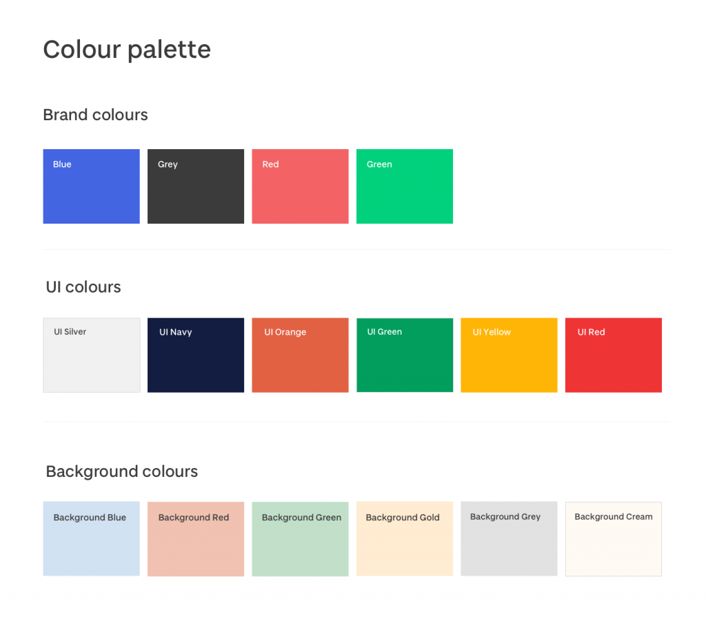
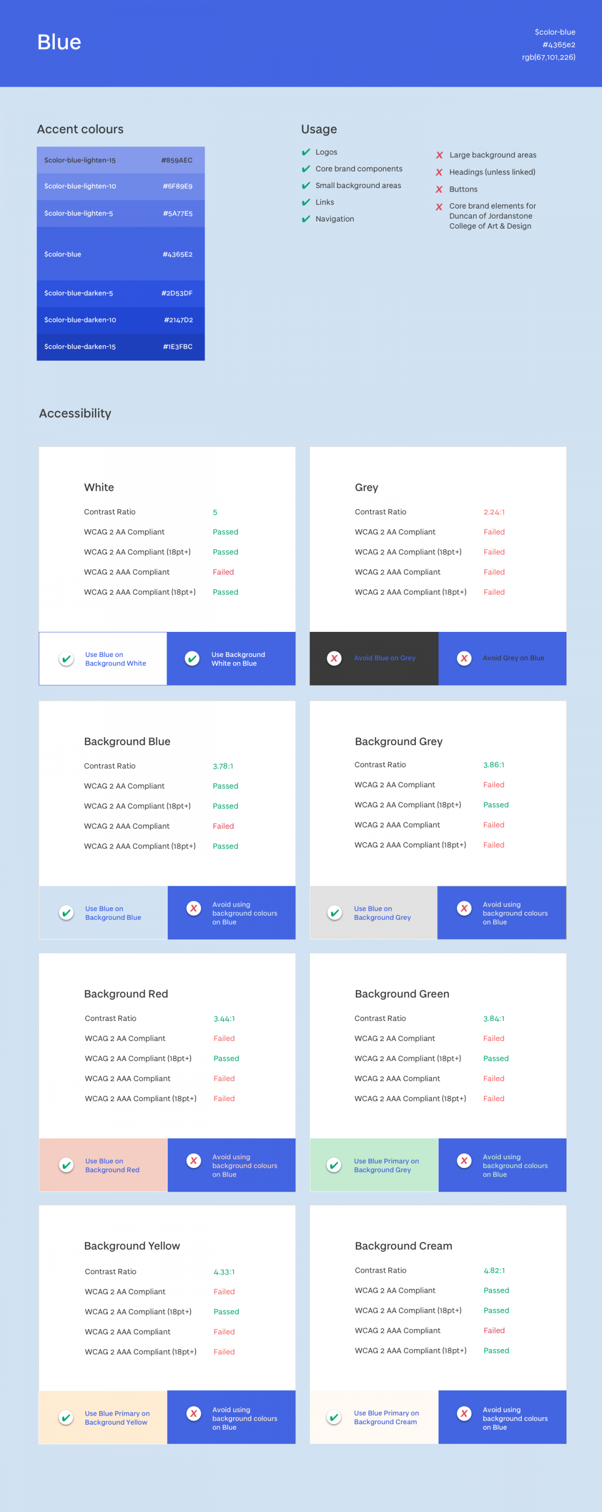
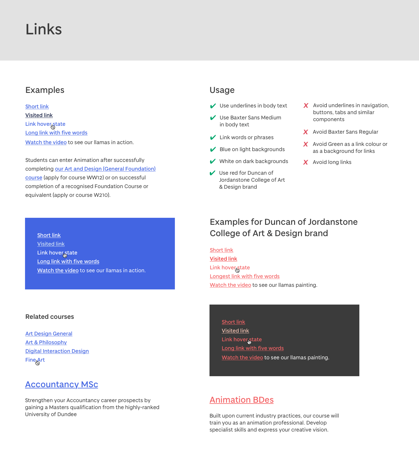
We have completed our work on the building blocks of the system (colours, typography, grid, etc). These may be adjusted again in the future test our ideas with real visitors on the early versions of the new University website. A good design system is a living and evolving thing that is constantly maintained over time to adjust to the needs and input of its users. And that’s what we’re aiming for.
A few examples of what we have been creating:
Colour
Typography, grid, and layout
Links
Design principles
Our design principles are practical values we can work to every day to help us make consistently good design decisions. They help us to put the emphasis completely on the goals of the user when we design.
What role does this system play on the new University website?
We are now starting to roll out gradual design enhancements to the ‘alpha’ version of the website. This is a very early release of what will eventually develop into the new University website as more content and features are added.
The ‘building blocks’ of the design system have been pre-defined in the design system and are being applied to the alpha website:
Visit the alpha website: https://alpha.dundee.ac.uk
We are using the alpha website to identify and design common patterns, which is the next stage of our work on the system. Anything that appears regularly throughout the content across the site can be considered a pattern. For example, bulleted lists, navigation menus, headings, buttons and so on. We take each of these and begin to experiment with their design, aiming to create something that works best for our audience and can be used across everything digital.
These patterns will be tested, documented, shared and reused as part of the design system. The end result should be consistent, effective, unique and user-friendly designs for every visitor.
Thanks for reading
Check out these related posts:


[…] This article is part of our ongoing design system series. Read more about our digital design system […]
[…] Our design team have been developing our own design system called BRGR (Burger) this year. Read more about BRBR. […]