
What is UX Scotland?
 UX Scotland is the conference for the UX, service design and digital communities, welcoming national and international participants to Scotland.
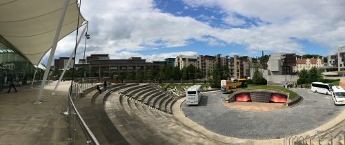
The event ran from 12 to 14 June 2019 in Edinburgh.
Who went to UX Scotland?
Last week saw Rob and myself return to Dynamic Earth in Edinburgh for this year’s UX Scotland conference. We would be running a workshop on Design Sprints and were excited to join the likes of Facebook, the UK Government, and the Australian Government as speakers at this brilliant annual event.
Joining us was fellow designer, Ryan, for his first taste of UX Scotland. Ryan was especially looking forward to once again experiencing the wonderful commute on Scotland’s fine railway service from Dundee to Edinburgh. This is a route he used to enjoy daily when working for an Edinburgh-based agency before joining the University of Dundee. He was not disappointed! It was really the only negative thing about the three days. (If you do this commute, you have our sympathy, or should I say empathy. That will make sense later).
Also attending (and speaking) were Michael Crabb and Rachel Menzies from the University’s computing department. They were enlightening the UX Scotland audience on important accessibility topics.
Why did we go to UX Scotland?
Over 340 people attended this year’s conference from businesses and organisations across the UK; from agencies to in-house teams, this was the place to be if your work involves thinking about users and their experience using an app, website, or service.
First things first; the organisers, Software Acumen, know exactly how to run a conference. They have this down to an art. From the venue, food, and copious amounts of coffee, to the quality of the speakers each year – they set the benchmark for all other conferences in Scotland. And as a speaker for the first time, both Rob and I were impressed at the communication and support we received.
What did we do at UX Scotland?
Rob and Ryan will share their experiences in separate blog articles. Me? I listened to and learned from the generous people who were willing to share their experience and knowledge on topics like:
- Engaging with stakeholders with a large organisation to instil a user-focused culture
- Selecting the most appropriate user testing method
- How to ‘practise depth’ as a designer (minimise distractions to concentrate)
- The importance of looking after the mental health of project teams
- Overcoming psychological biases to foster empathy
There was a lot going on outside of the sessions too:
- Friendly people to chat to about UX-related things like empathy, tone and voice, customer journeys, design sprints, and loading times (or just the terrible rainy weather)
- Excellent food, including vegetarian and vegan options
- Coffee, with unlimited refills (at least that was my assumption…)
- Event sponsors, we could talk to (if just to grab some freebies, including a nice black bottle opener)
- A chance to build Lego visual representations of things we wanted to achieve from the conference and hoped to do after the conference

Here’s a quick summary of some of the sessions that I found especially interesting:
Case study (Scott Logic): Practicing Depth
Synopsis
“To understand and solve problems well requires focus and depth of thought. Yet, unless mindful, our lives of IMs, notifications, emails and meetings don’t afford either. Breaking habits that fragment and splinter our time takes significant effort. Focus is a muscle, not a switch; from conscious exercise come both better work and greater satisfaction.”

My thoughts
Outlook. Gmail. Slack. Phone messages. Facebook. Twitter. LinkedIn. And the rest. Most of us will be using multiple communication apps. They are all vying for our attention every waking minute of our day.
The speaker reminded us that humans are monochronic. They can only fully focus on a single thing at a time.
Now, I have pretty solid control over what app can send me a notification. My personal Gmail account won’t send me any alerts during the day, for example. Slack, however, Slack owns me. That little red icon. I. Just. Have. To. Look. And this can be distracting and get in the way of truly deep immersion in my work.
During the early months of the Big Web Project, I got into the habit of closing Outlook and Slack when I needed to immerse myself in a challenging design problem. A solid 2-3 hours of work without any notifications is essential for this kind of ‘deep work’.
The speaker also recommended using my Mac’s Do Not Disturb feature so I’ll be trying that for certain periods of the day. Checking in with email and Slack are things that I’m going to schedule into my day as specific tasks. This should then develop into a habit.
Another top tip was to take 10 minutes at the end of the day to review how the day’s work went and to make notes for the next day so you’re prepared.
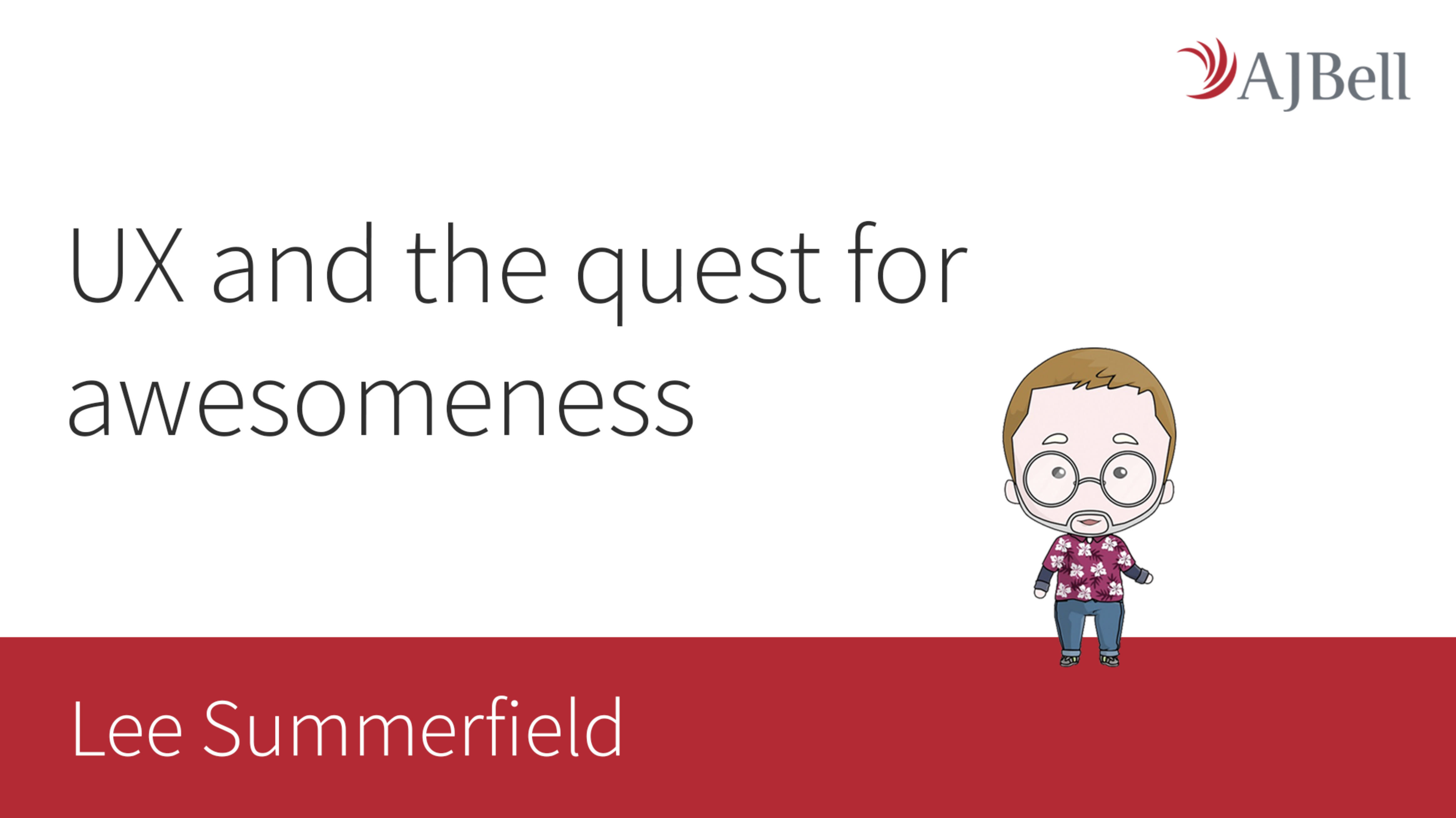
Case study (AJ Bell): UX and the quest for awesomeness
Synopsis
“No, not the first instalment in some dodgy J.K. Rowling spin-off series. Now I’m certainly not claiming to be awesome, but after 9 years’ experience as a UXer, I do know a thing or two. My role as Head of UX is not simply to implement UX processes and ideas but to inspire the business; to make other teams as passionate about UX as me (or you); to place UX at the very heart of the business. To achieve awesomeness I have a plan – I want to share that with you.”
My thoughts
This was great. The speaker shared the story of his career so far. He talked about how he got into UX and the roles he played in different companies. This included companies that were already practising UX. Companies that were desperate for an expert practitioner to deliver UX. And companies who had never heard of UX and didn’t fancy embracing it.
One thing really stood out – and it wasn’t the free Skittles, although that was a nice touch – a slide that showed how the speaker had planned to make a big impact at AJ Bell (an investment platform) and build UX into their standard processes throughout the company. Luckily, this is a company that sees UX as a competitive advantage. They want to make UX the “pulse” of the company. They see UX as a way to understand what their customers need and to ensure they keep them engaged and happy to recommend their products to others.
The speaker used a visual mapping tool called Miro to build a plan he could easily share and explain to anyone. It also helped to keep him on track of his personal progress throughout his years of employment at the company. It shows how he planned to build a UX team, roll out a design system, engage with other non-UX staff in the company, and share his experience at UX conferences each year:

You’ll see ‘UX COP’ at the bottom. This stands for Community of Practice. Every Friday, the speaker invited anyone from the company to discuss problems with customers and their products, contribute ideas, sketch solutions. Almost like a mini design sprint each week. This proved very successful and helped to spread the word about the importance of UX.
Case study (Facebook): Overcoming psychological biases to foster empathy
Synopsis
“Human psychology, cognitive biases, empathy and emotion. Why are these phenomena important to understand when building products and services? Using examples from user research studies, this talk will highlight how empathetic design is of benefit to both the user and the business, how cognitive biases are a blocker to empathising with people, and how to set up research to overcome cognitive biases.”

My thoughts
A designer must step outside of their own limited perspective and place themselves in the mind/shoes/eyes of someone else (for example, an undergraduate student, a postgrad researcher, a parent, etc). So bias is our enemy.
This is one of my favourite topics and is especially relevant as we launch the beta version of the university website. This was a very enjoyable talk that covered a lot in 45 minutes.
Here are some highlights:
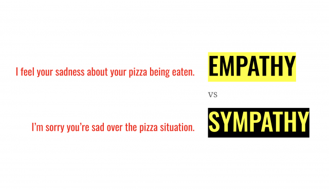
- Empathy vs sympathy (“I can imagine what someone’s experience feels like and can feel the same emotion” vs “I care and feel sorrow towards someone’s situation”)
- Empathy is derived from and enhanced by user research (like our Top Task research in 2018)
- False consensus effect – “I think a certain way so lots of other people must do too”. For example, “Everyone loves pizza! Who doesn’t love pizza?!”
- Confirmation bias – how we subconsciously avoid or ignore information that goes against our belief or theory. For example, you can find information to support both sides of practically any argument with a quick Google search. But, when it comes to making decisions about your website or app, the real answer should come from your users. Bias creates an ‘empathy gap’
- The empathy gap can be reduced by speaking to users and by using the same tools they use. For example, people with visual impairments rely on screen readers so as website designers, we should spend time using these tools to complete tasks and experience this perspective
- We shouldn’t seek to validate our assumptions, we should aim to prove our theories wrong – to really challenge our decisions
- We should test our riskier assumptions first
- It’s important to perform user testing as a team and not rely on a single UX tester (to avoid bias and to bring the team together for an important purpose)
- It’s important to share recordings of user testing sessions so more people can share multiple user perspectives

Workshop (University of Dundee – that’s us!): How to solve problems and make friends with Design Sprints
Synopsis
“A design sprint is a framework for understanding and solving a problem by testing new ideas – fast! In this fast-but-fun workshop, you will:
- think about users with customer journey mapping
- think about content using content modelling and priority guides
- get creative with ‘Crazy 8’ sketching
- have your say using sticky dot voting and solution discussions
- learn about effective prototyping and user testing”

My thoughts
This workshop was run by Rob and myself. We enjoy running design sprints here at the university and have learned so much through this process. This workshop was based on what we have learned after 20+ sprints with staff and students. The aim of this workshop is to encourage people to run their own design sprints and to give them a head-start with some information and resources.

We had 2 hours to deliver the workshop. This included running a 90-minute example design sprint to demonstrate the process. We came up with an example challenge that the participants would work together to solve; “How can we make it easier to book the Salisbury Suite for meetings?”
The audience responded well and seemed to enjoy the experience.

As you’d expect from a room full of UX people, they grasped the main concepts quickly and enjoyed the activities like the ‘Crazy 8’ sketching. We are still looking through the ideas sketched out by the participants but we saw some real inventiveness on the day.
Conclusion
We all left the conference wanting more. More nice people to talk to, more interesting and inspiring sessions, and more tasty lunches. Probably not more coffee though, for the sake of our health.
We’re already talking about submitting at least two potential talks for UX Scotland 2020. See you next year, UX Scotland!