Not sure what a Design Sprint is? These are fun, interactive problem-solving sessions with students, staff, and other key audience members. For more information, read Join a Design Sprint to shape future website experiences
Our first Design Sprint took place on 13th February. 12 people from around the University gathered together with Rob (UX Manager) and myself (Design Manager) from Web Services.
We spent a fun and informative day working together trying to solve one of the many problems we face as we create a new university website. The challenge we set ourselves for the day was solving this problem: How do we improve staff information on the website?
Morning, Day 1: Reviewing the problem together
The first part of the Sprint saw Rob and myself presenting some background information about the problem:
- We talked about the top task research relating to staff
- We presented some unusual solutions from other industries
- We showed some early ideas we had created last year
- We revealed some interesting statistics about how in-demand the staff content really is (the sections containing staff profiles are the highest trafficked sections on every school site)
Everyone was encouraged to make notes during the morning, using a post-it note for each thought or point they wanted to discuss later. During a coffee break, these notes were grouped under headings like ‘Content’, ‘User Experience’, ‘Design’, and so on.
Photo: Examples of notes made by participants during the Design Sprint
We had some great discussions throughout the morning:
- a review of the top tasks relating to staff content (what people have told us they want)
- a review of some example solutions from industries outside of Higher Education
- user journeys (how might visitors reach a staff profile)
- how people felt about the current solutions (i.e their own staff profile, trying to find staff members, etc)
- should everyone have a staff profile
- how do we get the information we need
- how do we encourage people to update their profile
- how do we handle the wide variation of staff and the varying amount (and types) of content
Afternoon, Day 1: Brainstorming a solution
After a free (and tasty) lunch, the group worked on defining goals and a target audience for the solution they would sketch out. We talked about what is a suitable goal using the HEART framework (Happiness, Engagement, Adoption, Retention, Task completion).
We discussed how a staff page (like much of our content) has to cater or adapt to many different audiences (prospective student, current undergraduate student, current postgraduate student, teaching staff, research staff, and numerous other variations).
Crazy 8s
Then it was time to sketch! We used a technique called Crazy 8s to allow each member of the sprint group to get as many of their ideas down on paper as possible. Each person presented their ideas, then we voted on our favourites, and discussed them.
Photo: ‘Crazy 8’ sketches
Solution sketches
We then moved on to sketch out what we each thought would be a great solution to the problem.
There were a fantastic amount of great ideas being expressed here. And that is exactly the point of the Design Sprint process; to draw out the unique ideas we all have. It isn’t just people working in creative roles that have unique ideas, everybody has them and everyone should have an opportunity to contribute to the new website. It will be a better experience for our visitors as a result.
There were two solutions that, based on the votes and a group discussion, were taken forward to the next stage (prototyping).
Photo: Presenting a solution sketch
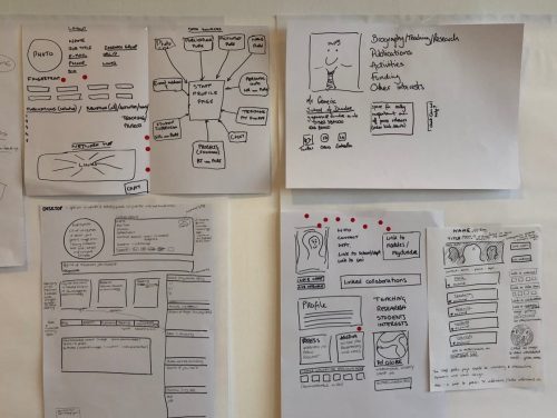
Photo: Solution sketches with dots used for voting
Day 2: Prototyping a solution
A prototype is an experiment to test out a hypothesis. We created a prototype based on chosen solutions, combining ideas from them both into a visual concept. We can use this prototype to get a reaction and learn something tangible (without spending months building a full solution).
Although the prototype isn’t necessarily the final design, it was realistic enough to enable an assessment to be made about the viability of the ideas it contained. Do people like large images on this kind of content? Are ‘roles’ better than job titles? Is live chat a potentially useful feature?
We’re trying to answer as many questions as possible relating to how people might find staff profile information like publications, contact information, location, etc.
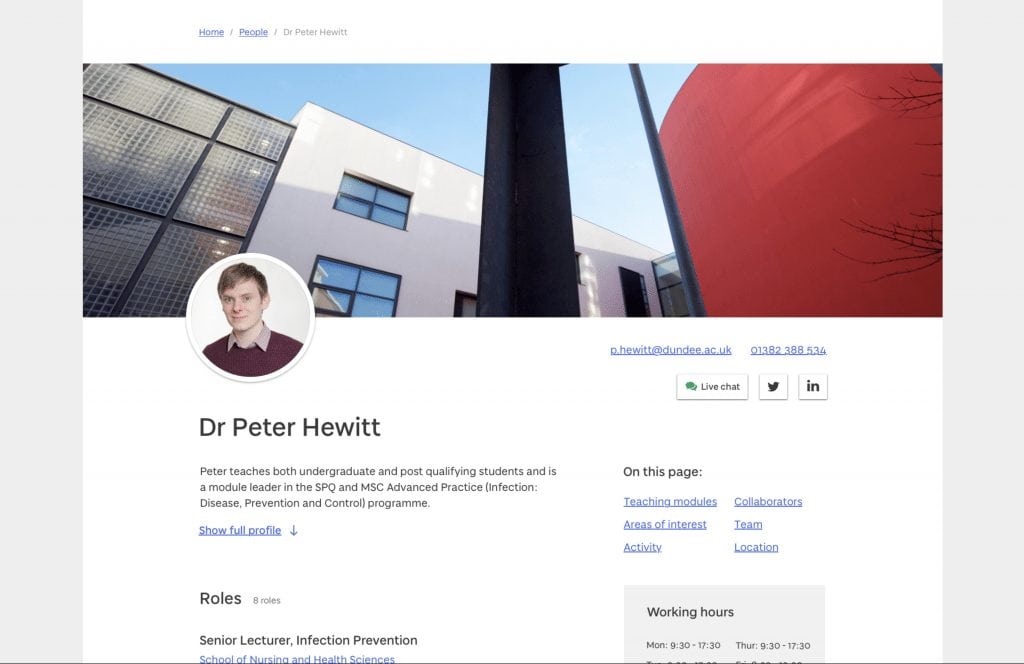
Image: The top section of the prototype solution
View the full prototype
Please take a look at the staff profile prototype and add your comments (keeping in mind the problem we are trying to solve).
Staff profile prototype
Feedback
We have already received a good amount of feedback. We can see things that we need to change, things we might have missed out completely, as well as confirmation of things that do work well.
Your feedback is important and we’re grateful to have it.
Day 3: User testing
On Day 3, our team ran user tests to get feedback on the prototype. Watching our users try out the prototype is the best way to discover major issues with the solution, which in turn enables us to start iterating and improving the concept to help us solve the problem.
Photo: A demonstration of the prototype in the Tower Building on campus
What happens next?
This prototype has been added to the Alpha website and will be tested with our visitors. We are also continuing to test it across the university, gathering as much feedback from staff and students as possible.
The concept will be evolved based on the feedback we receive. If you have attended the sprint or left a comment on the prototype, we will contact you at a later stage to get more of your valued feedback as the project progresses.
Did you attend the sprint? Thank you!
A huge thank you to all of the attendees of our first Design Sprint. We really do appreciate your time and input. You have told us that you enjoyed the day and the process – we did too!
We took photos of all of the notes and sketches generated on the day. The ideas have been recorded and will have a big influence on the final solution that we will build later in the year. Some ideas can be implemented as part of the new website launch, some will require more thought and future development time. As we said on the day, weird, impossible, and impractical ideas often give way to truly inspired ones!
Couldn’t make it? Join another Design Sprint to share your ideas
With a more traditional ‘design, build, and launch’ approach, people don’t get a chance to contribute their ideas until the website is almost finished, when the design process is complete and the site has been developed. At that stage, it’s simply too late to properly react to great ideas and detailed feedback
We ask everyone reading this to take part in a sprint (there are lots more coming up) to help shape future website experiences for students, staff (and yourself!). If you can’t make it to a sprint, please tell everyone you work with what we are doing.
[tribe_events view=”list”]


[…] Design Sprint #1: Staff profiles and staff listing – Read the review Tue 13 February 2018 […]