Not sure what a Design Sprint is? These are fun, interactive problem-solving sessions with students, staff, and other key audience members. For more information, read Join a Design Sprint to shape future website experiences
Our third Design Sprint took place on 13 March 2018. 16 people from across External Relations, School of Medicine and Business Transformation gathered together with Steve (Design Manager) and myself (UX Manager) from the Web Services Team.
| Directorate of External Relations | |
| Access and Participation | 1 |
| Admissions and Applicant Experience | 1 |
| Enquirer and Applicant Communications | 1 |
| Global Engagement and Recruitment | 1 |
| Marketing and Communication | 4 |
| Web Services | 3 |
| School of Medicine | |
| Medicine Office | 2 |
| Postgraduate Medical Education | 2 |
| University Executive Office | |
| Business Transformation | 1 |
| Total | 16 |
We spent a fun and informative day working together trying to solve one of the many problems we face as we create a new university website. Our challenge for the day was:
‘How can we display course information effectively for prospective students?’
Morning, day 1: reviewing the problem together
The first part of the Design Sprint saw Steve and I presenting some background information about the problem.
We started with discussing user frustration.
- Page length
- Clarity of key information
- Mobile navigation
- Design issues
We then discussed the top tasks that have been identified and voted on by applicants and current students. This gave the participants evidence of the priority that content could be presented in.
Top tasks for applicants
| Position | Task |
| 1 | Check entry requirements for a course |
| 2 | See the modules for a course and how they are taught and assessed |
| 3 | Search for a course |
| 8 | Compare two or more courses |
| 9 = | See a list of courses and filter them |
Top tasks for current students
| Position | Task |
| 3 | See a list of module/coursework deadlines for the whole year |
| 6 | See the modules for a course and how they are taught and assessed |
| 8 | Find out what is on the reading list for a specific course |
| 10 | Find out more details about a course |
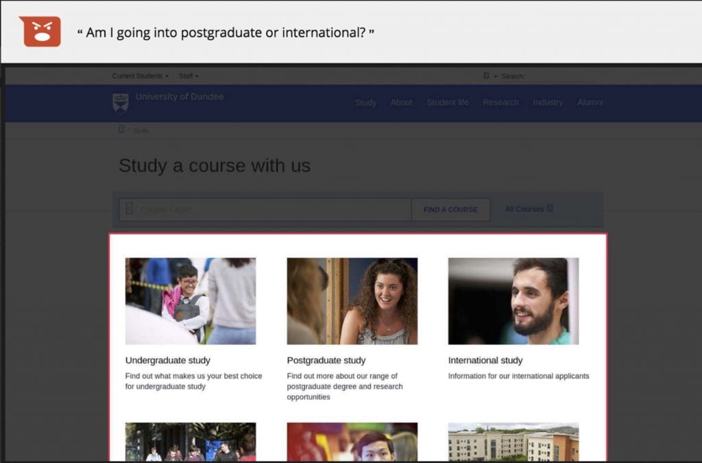
User feedback
We then moved on to discuss the feedback that has been provided on the existing pages, using our feedback gathering tool.


User journeys
Using one of our analytics tools, we are able to select a page and see the incoming and outgoing paths for the page. Below is an example of an existing undergraduate course page.
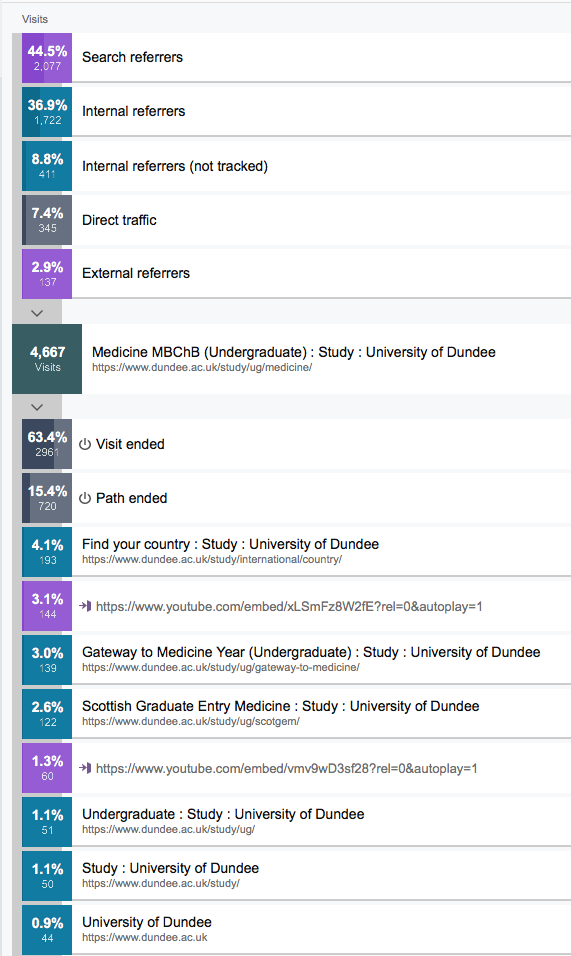
We can see that just over 44% of the traffic to this page is being generated by search engines, such as Google, Bing and Yahoo. Almost 46% percent is coming from internal pages on dundee.ac.uk. 7.4% is direct traffic – this means someone has entered the web address directly or had it saved as a bookmark. Lastly, just under 3% is coming from external websites.
Defining content requirements
After discussing the problem, we moved on to discuss how to define content requirements.
We also went through the publication from HEFCE (Higher Education Funding Council for England) called “Guide to providing information to prospective undergraduate students”. This guide is to help higher education providers follow good practice in supplying easily accessible information for prospective students to use in their decisions about higher education study.
We then handed over to the participants to brainstorm the content requirements for a course page and how it should be prioritised.
Problem and content discussion
Before we thought about solutions, we asked the participants “do we fully understand the problem?”
- What is your experience of the problem?
- Let’s review the post-it notes
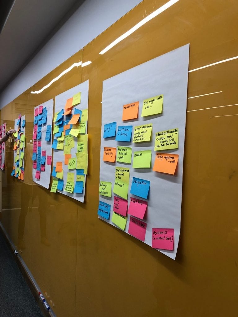
Photo: Examples of content ideas for course pages made by participant teams during the Design Sprint
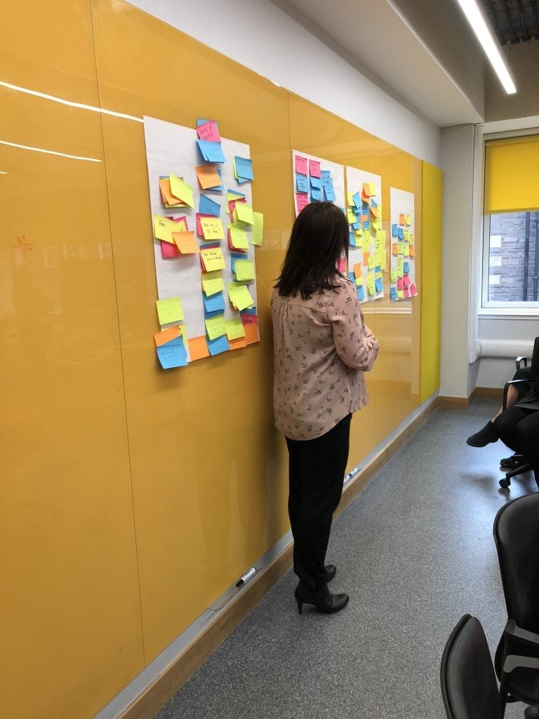
Photo: Examples of content ideas for course pages made by participant teams during the Design Sprint
Afternoon, day 1: brainstorming a solution
After the free lunch (come along to the next Design Sprint and you’ll get lunch too!), we discussed how we could measure success by setting goals using HEART framework goals.
Happiness
User attitudes, often collected by a survey
Engagement
Frequency, intensity or depth of interaction
Adoption
Gaining new users of a product or feature
Retention
The rate at which existing users are returning
Task completion
Efficiency, effectiveness and error rate
We also discussed how the course page could adapt to different audiences. For example, depending on the location that someone is browsing from, would it be good for the user to see a reduced set of entry requirements?
Crazy 8s
Now it was time to move onto the first bit of sketching for the day.
The participants fold a sheet of A3 paper into eight rectangles.
They then sketch an idea in each rectangle or sketch a journey.
We then give the participants the following guidance.
- Go for quantity, don’t worry about detail or making these beautiful, just try to get your idea across
- Focus on the core elements or just part of the page
- Weird, impossible, and impractical ideas often give way to truly inspired ones
Eight ideas in eight mins. GO!
The Countdown clock that we played for the last 30 seconds of the 8 minutes
Once the participants had completed their eight sketches, we asked each person to present their ideas and then each person voted on their favourite ideas.
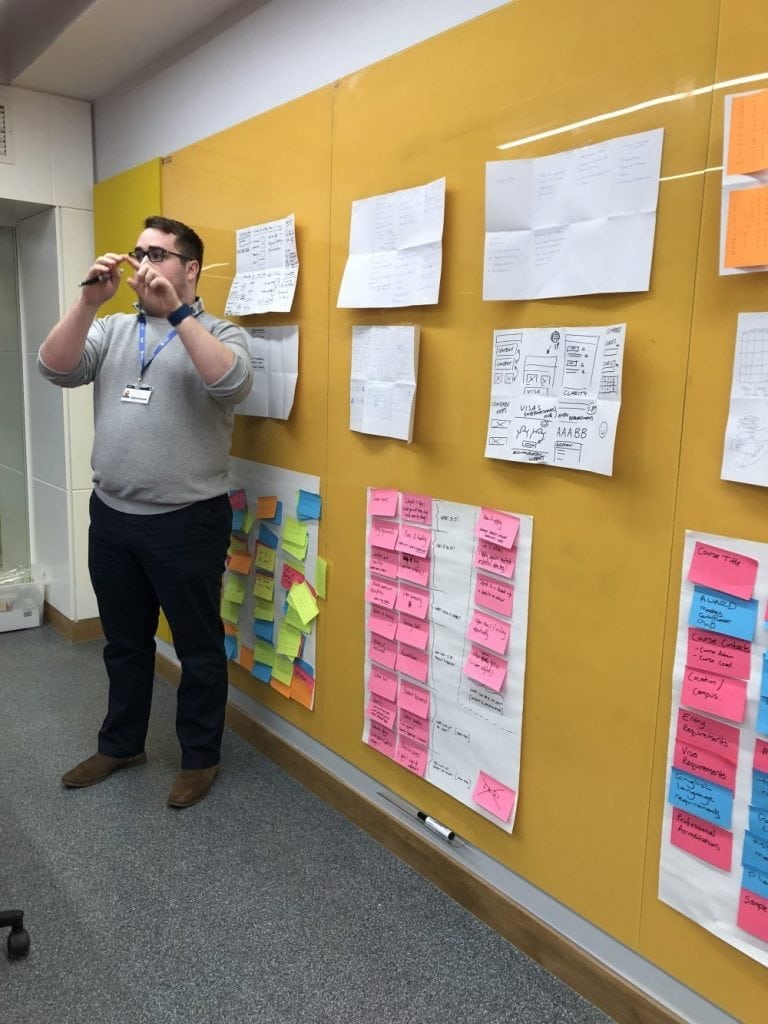
Photo: One of the participants presenting their Crazy 8s
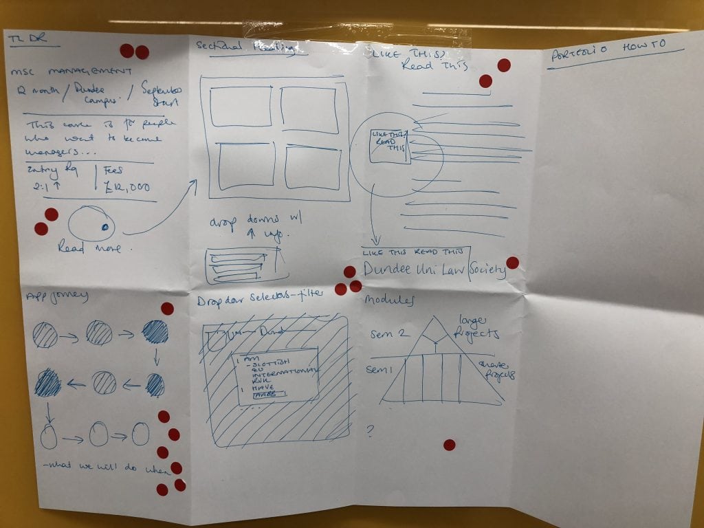
Photo: One of the Crazy 8 sketches with votes
Solution sketches
After doing the Crazy 8s and voting, the participants were then given 30 mins to draw a solution taking inspiration on the ideas from the the Crazy 8s and what had been voted on.
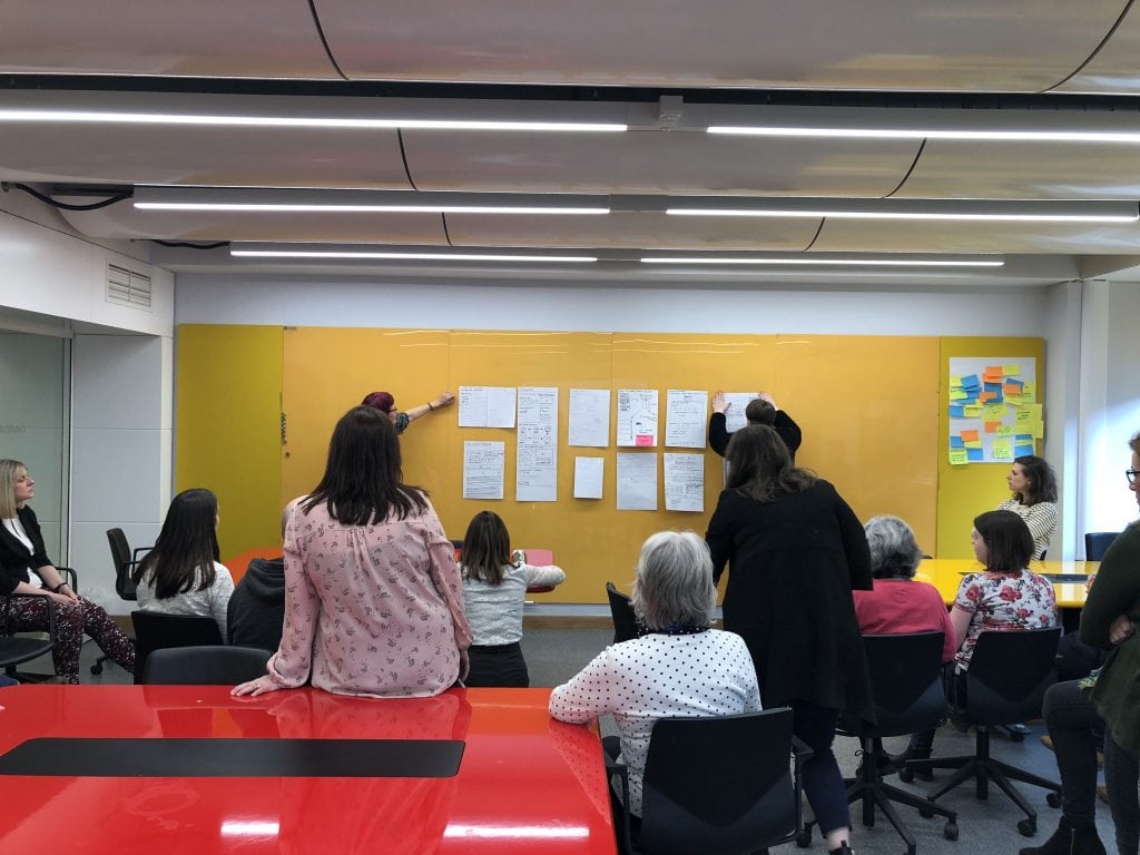
Photo: Participants discussing their solution sketches
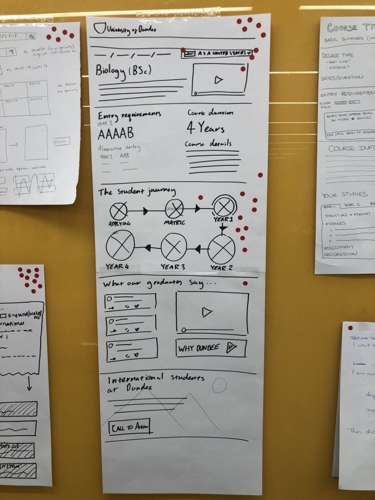
Photo: One of the sketches with votes
Once the discussion and voting had been completed, the group came together to discuss which elements from the sketches would make it to the prototype stage.
Day 2: prototyping a solution
To test the ideas from the voted solutions a prototype was designed by Steve, our Design Manager.
Whilst this is not the final design, it allows us to share the prototype for testing and comment from the wider community.
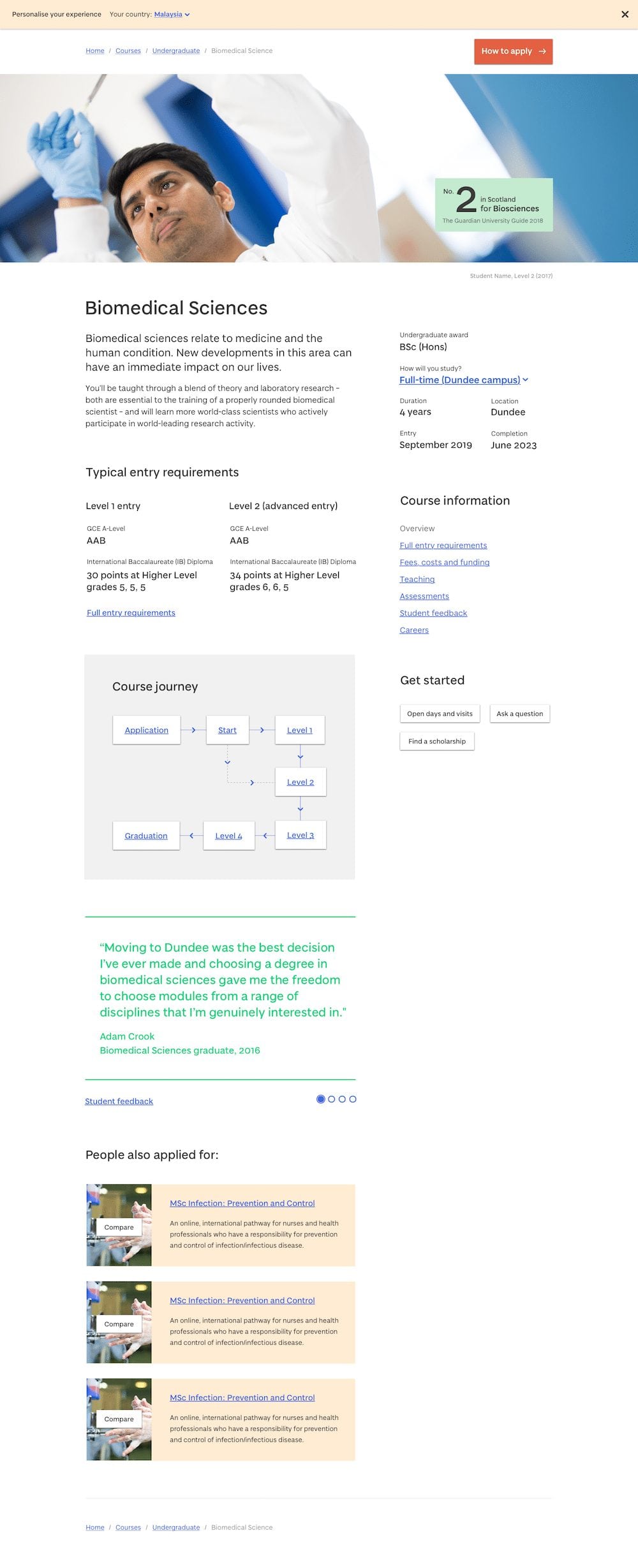
Photo: The first page of the prototype
View the full prototype and give feedback
Please take a look at the course page prototype and add your comments (keeping in mind the problem we are trying to solve). This prototype has interactive areas that you can click on to see other pages and tips.
Course page prototype
Did you attend the Design Sprint? Thank you!
We’d like to thank everyone that took a day out of their schedule to join us on the journey to a new course page experience.
There were great ideas and discussions throughout the day and Steve and I were taking notes, furiously, the whole day to feed into the design process.
Didn’t make the Design Sprint? Join us at the next one.
We have Design Sprints booked every two weeks on a Tuesday for the whole of 2018.
Please see the list below and book onto a Design Sprint or two of your choice.
A day may seem like a lot of time to commit, but when you consider that our website has over 3.5M visitors annually from every country in the world then it’s vitally important that we get this right. We can’t do that without engagement from the University community so anything you can do to either get involved, or encourage others to get involved, would be much appreciated!
[tribe_events view=”list”]
