Not sure what a Design Sprint is? These are fun, interactive problem-solving sessions with students, staff, and other key audience members. For more information, read Join a Design Sprint to shape future website experiences
Our fourth Design Sprint took place on 27 March 2018. 14 people from across the University gathered together with Steve (Design Manager) and myself (UX Manager) from the Web Services Team. There were however 5 people that booked that didn’t show 😞
| Checked-in | Booked | |
| Directorate of External Relations | ||
| Marketing and Communication | 2 | 3 |
| Web Services | 2 | 2 |
| Directorate of Human Resources and Organisational Development | ||
| Equality and Diversity | 0 | 1 |
| Directorate of Library and Learning Centre and Culture and Information | ||
| Centre for Technology and Innovation in Learning | 1 | 1 |
| Research and Resources | 1 | 1 |
| Service Delivery | 1 | 1 |
| Directorate of Student Services | ||
| CASTLE Careers and EIS | 1 | 1 |
| Directorate of UoDIT | ||
| UoDIT Office | 1 | 1 |
| School of Education and Social Work | ||
| Education and Social Work Office | 1 | 1 |
| School of Medicine | ||
| Medicine Office | 1 | 1 |
| Postgraduate Medical Education | 3 | 4 |
| PGT student | 0 | 1 |
| DUSA | 0 | 1 |
| Total | 14 | 19 |
We spent a fun and informative day working together trying to solve one of the many problems we face as we create a new university website. The challenge we set ourselves for the day was solving this problem:
‘What information should a school website communicate?’
Morning, day 1: reviewing the problem together
The first part of the Design Sprint saw Steve and myself presenting some background information about the problem.
We started with discussing why school webpages were a challenge.
- Duplicated content
- Evidence of user frustration/confusion
- Multiple layouts and templates affects brand trust
- New website!
We then discussed the user stories that have been identified and voted on by staff. Applicants and current students had not mentioned schools when providing user stories. This is particularly important to note – applicants and students are not bothered by our structure. Paul Boag (User Experience Designer, Service Design Consultant and expert in digital transformation) says it best;
Creating a site information architecture is a dangerous business. Too often it ends being structured around organisational silos rather than user’s mental models.
Read more about information architecture from Paul Boag.
User stories for staff
As a staff member
I want to find rankings/awards for schools and subjects
So I can use these for recruitment of students
As a staff member
I want to see who works in a school/directorate and what their roles are, including their organisational hierarchy
So I can find people easily
Site search statistics
We use a search engine called Funnelback on our site. This allows us to see numbers of searches, amongst other statistics.


Looking at the academic year so far, we can see that the top keyword for course search is “languages” with over 84,000 searches. In comparison, the highest search for a school was 211.
User journeys
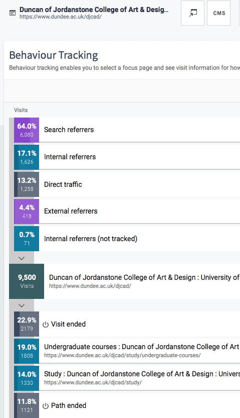
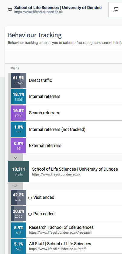
Using one of our analytics tools, we are able to select a page and see the incoming and outgoing paths for the page. We can see how much traffic is being generated from search engines, internal referring pages, external referring sources and direct traffic (people entering the URL or having it saved as a bookmark or homepage).
You can see two example schools below for January-March 2018.
Defining content requirements
After discussing the problem, we moved on to discuss the traditional approach to web content.
- Content is an afterthought
- No appreciation of user needs
- No understanding of the user journey or context
- Assumption that print content is fine for web
- Badly written and off-brand
- No understanding of the connections between different types of content
- Content creation is expensive, disruptive and inefficient
We then handed over to our participants to ask them to define the content requirements for this challenge.
Problem and content discussion
Before we thought about solutions, we asked the participants “do we fully understand the problem?”
What information should a school website communicate?
- Thoughts from post-it notes about the lightning talks
- Existing school sites experience
- User research
- What is your experience of the problem?
Goal setting
We then discussed how we could measure success by setting goals using HEART framework goals.
Happiness
User attitudes, often collected by a survey
Engagement
Frequency, intensity or depth of interaction
Adoption
Gaining new users of a product or feature
Retention
The rate at which existing users are returning
Task completion
Efficiency, effectiveness and error rate
Some examples:
- We should use visual media to give an impression of the school (Happiness)
- The audience should be able to search the school (Engagement)
- Contact details for staff should be prominent (Task completion)
Afternoon, day 1: brainstorming a solution
After the free lunch we allowed some time for people to collect their ideas and understanding from the morning session before moving onto the sketching.
Crazy 8s
Now it was time to move onto the first bit of sketching for the day.
The participants fold a sheet of A3 paper into eight rectangles.
They then sketch an idea in each rectangle or sketch a journey.
We then give the participants the following guidance.
- Go for quantity, don’t worry about detail or making these beautiful, just try to get your idea across
- Focus on the core elements or just part of the page
- Weird, impossible, and impractical ideas often give way to truly inspired ones
Eight ideas in eight mins. GO!
The Countdown clock that we played for the last 30 seconds of the 8 minutes
Once the participants had completed their eight sketches, we asked each person to present their ideas and then each person voted on their favourite ideas.
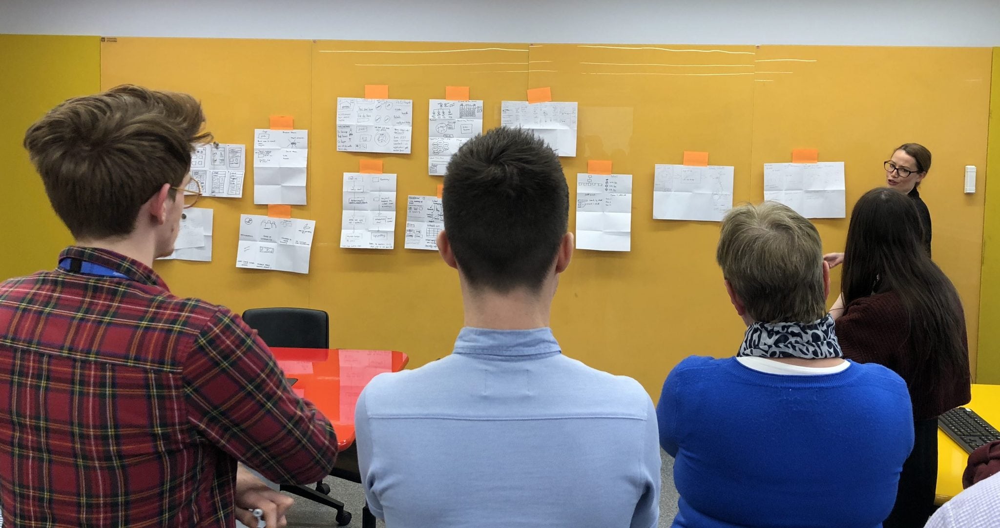
Photo: One of the participants presenting their Crazy 8s
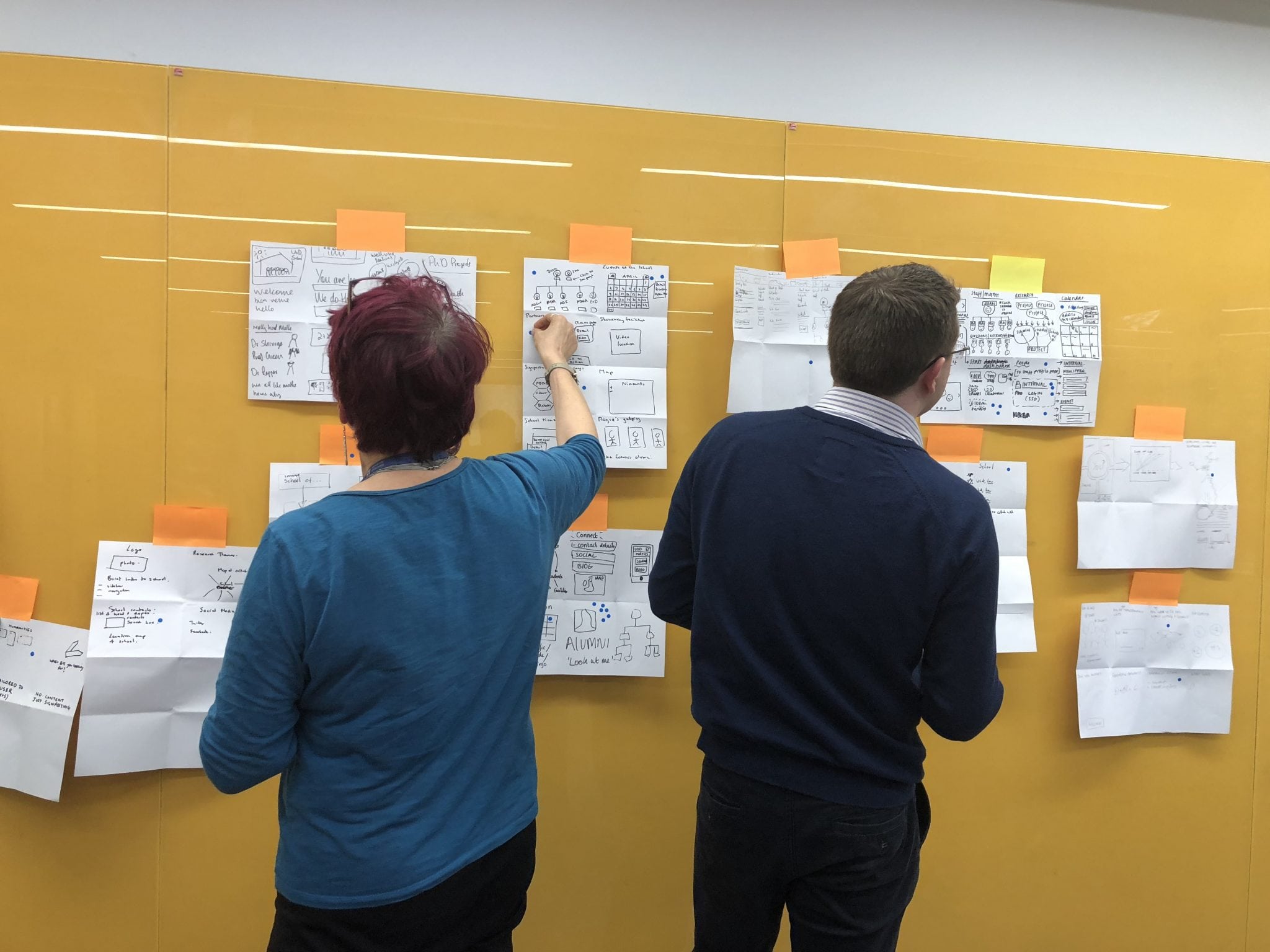
Photo: Participants voting on ideas
Solution sketches
After doing the Crazy 8s and voting, the participants were then given 30 mins to draw a solution taking inspiration on the ideas from the the Crazy 8s and what had been voted on.
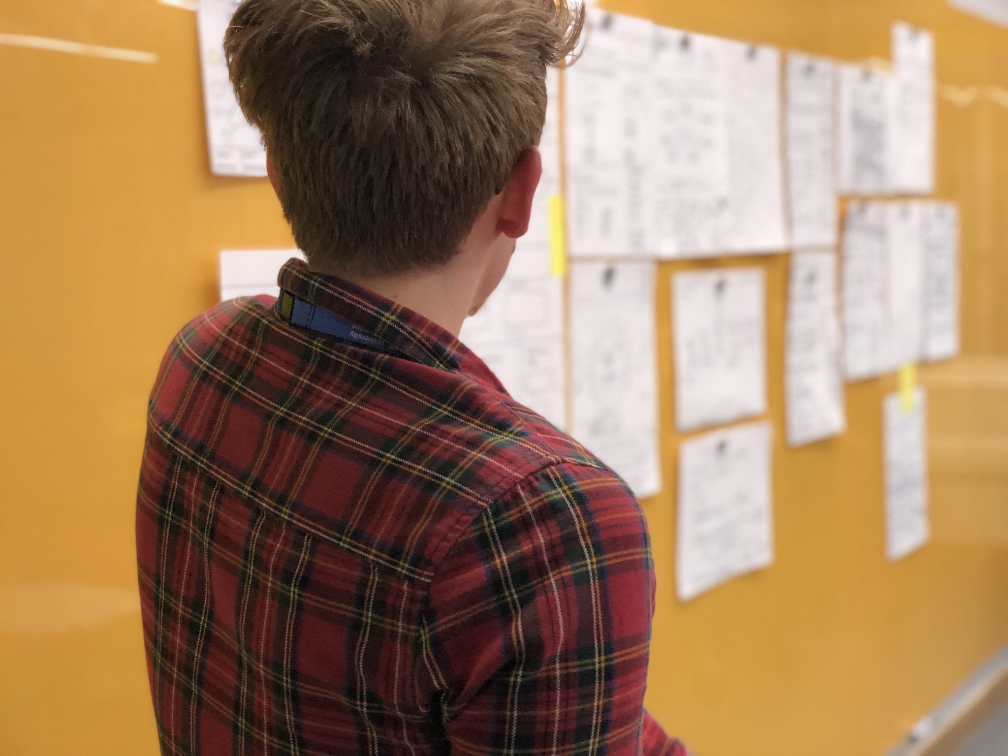
Photo: One of the participants discussing their solution sketches
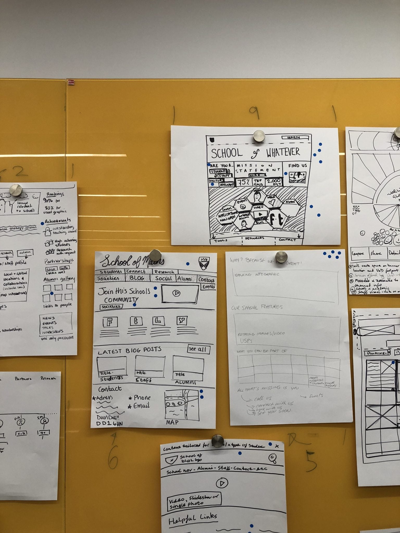
Photo: Solution sketches with votes
Once the discussion and voting had been completed, the group came together to discuss which elements from the sketches would make it to the prototype stage.
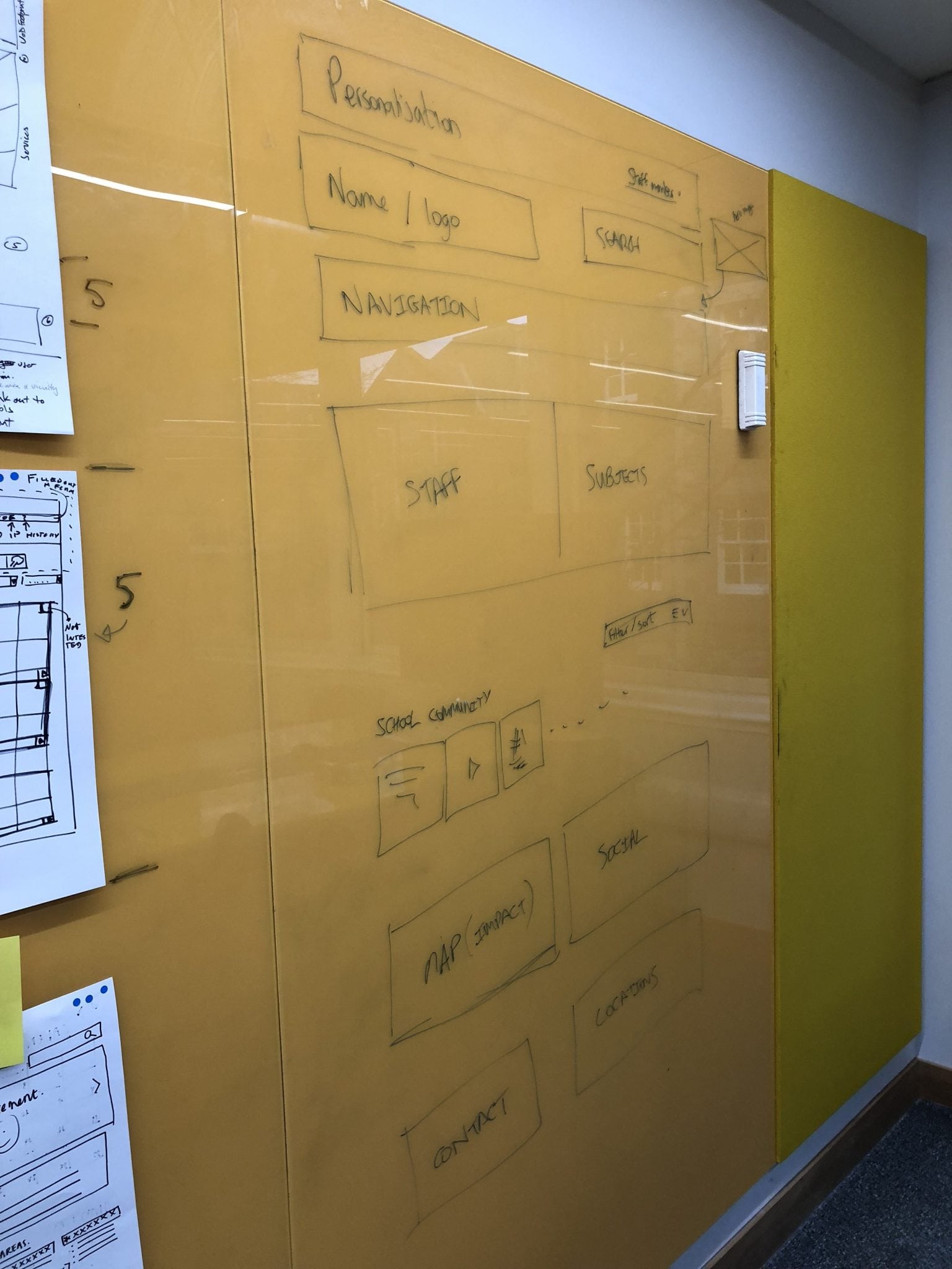
Day 2: prototyping a solution
To test the ideas from the voted solutions a prototype was designed by Steve, our Design Manager.
Whilst this is not the final design, it allows us to share the prototype for testing and comment from the wider community.

Photo: The school page prototype
View the full prototype and give feedback
Please take a look at the course page prototype and add your comments (keeping in mind the problem we are trying to solve). This prototype has interactive areas that you can click on to see other pages and tips.
School page prototype
Did you attend the Design Sprint? Thank you!
We’d like to thank everyone that took a day out of their schedule to join us on the journey to a new course page experience.
There were great ideas and discussions throughout the day and Steve and I were taking notes, furiously, the whole day to feed into the design process.
Didn’t make the Design Sprint?
Don’t worry we have Design Sprints booked every two weeks on Tuesday for the whole of 2018.
A day may seem like a lot of time to commit, but when you consider that our website has over 3.5M visitors annually from every country in the world then it’s vitally important that we get this right. We can’t do that without engagement from the University community so anything you can do to either get involved, or encourage others to get involved, would be much appreciated!
Please see the list below and book a place on a Design Sprint or two that interests you.
[tribe_events view=”list”]

A great write up – shows the methodology & findings really well. Have already attended one sprint and am coming to several more. Highly recommended.