It has been a great start to 2019. Okay, so 2019 started five months ago but it has flown by.
We have been working with our partners Manifesto and Acquia on a rather sizeable project to replace the University website. We are starting from scratch. A blank page. Lots of blank pages, in fact. New content, new designs, new code, new processes. New everything. I even bought some new pencils…
Our partners turned out to be smart, personable, and extremely well-organised people. Everything is planned and executed like we’re in the military. In a good way, I mean. We don’t have to salute on the daily stand-up video calls every morning or anything like that.
For more information about our project and our partners read this: Introducing our new CMS platform and partners
This has certainly been an intense project.
However, we can look back with pride on what has been achieved between the various teams working together across design and development in a matter of months:
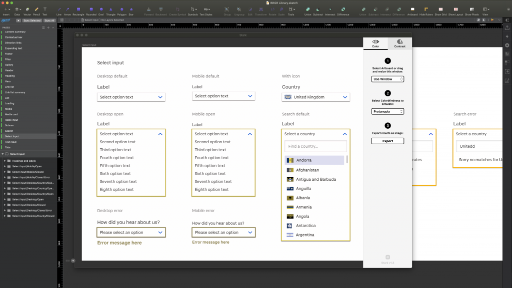
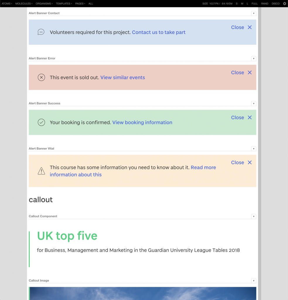
- a new design system with over 30 components, each with multiple variations and responsive states
- a pattern library full of accessible, mobile-friendly components and templates
- full integration with a new Drupal-powered website that will allow content editors to easily select templates and drop components into a page
This post is a breakdown of what’s been keeping the coffee flowing and our pixels pushed so far this year.
Building on 2018 (“The Year of the Design Sprint”)
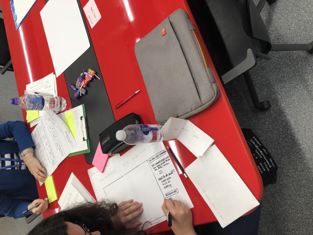
In 2018, we invited every student and staff member to join the research we were doing as part of our project by attending a design sprint. A design sprint brings people together to solve problems by generating ideas, coming up with solutions, and picking a final solution to test with real people (aka ‘users’).
We ran over 20 design sprints with staff and students last year, tackling problems like these:
- How do we help people find staff information?
- How do we better serve people who want information about subjects?
- How do we improve the course page experience for prospective students?
- How can we make comparing courses easy and enjoyable?
- What information should a country page provide to meet the needs of the audience?
Ideas and solutions gathered from design sprint participants have been used throughout the design process in 2019.
Alongside the top task research, this has been the foundation of what you will see on www.dundee.ac.uk in the future. We gathered many, many insights as part of this process – honestly, this has been invaluable to us. A huge thanks if you made it to a design sprint – we hope you enjoyed the experience.
There will be more design sprints in the future – there will always be complex problems to tackle.
So the main point here, the TL;DR (Too Long; Didn’t Read), is that our design is driven by research to achieve original, effective solutions. Which is very appropriate for a research-led university.
A new approach to working with content; priority guides
Traditionally, we have used wireframes to form the basis of our designs. These were a fast technique to create layouts based on content provided to us in a Word document or an email. Occasionally in the past, we’d find that there was no real content to incorporate into the wireframes or the design team would have to make decisions about what that content might be.
By their very nature, wireframes are quite high level and abstract; they don’t require you to present content structure in any detailed way and this can lead to designers making assumptions about how a feature on a website should look and function. In other words, using wireframes can increase the risk in a project and cause delays should you find these assumptions were wrong.
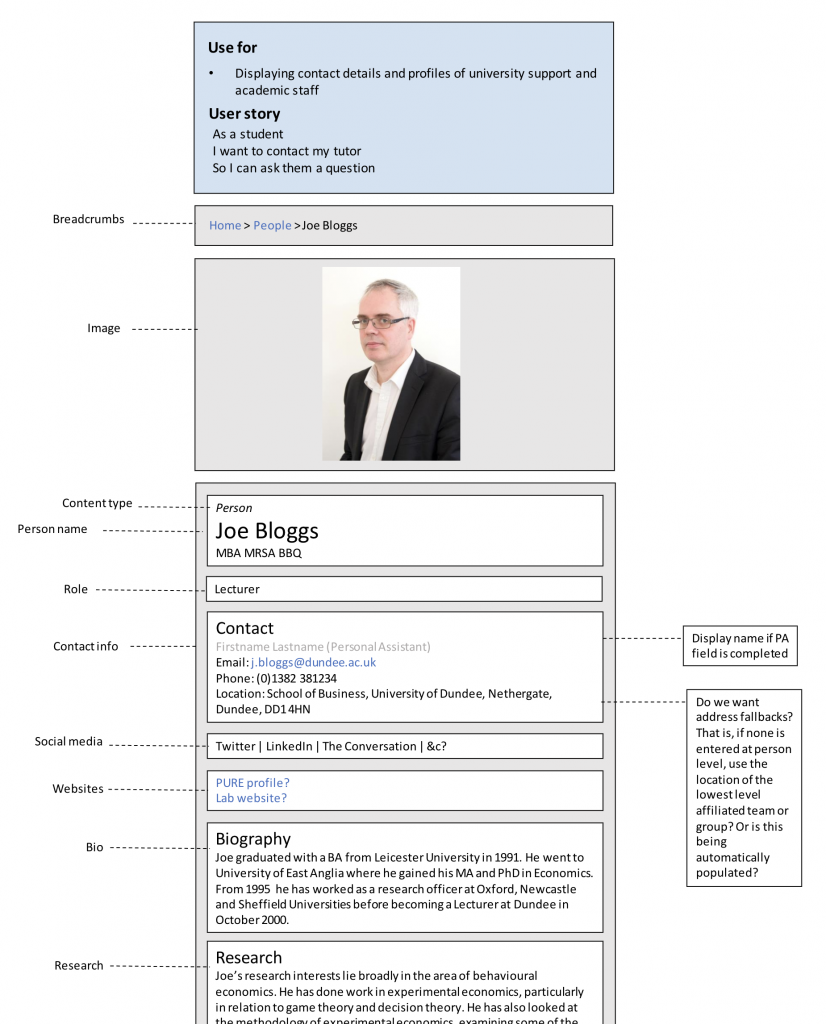
So, we looked for alternative processes and discovered priority guides. A priority guide is a single column of content presented in simple boxes with annotations that explain the purpose and origin of each bit of content. To create a priority guide you need to know how content will be structured. Typically this task falls to the content team who, using knowledge and research, divide content up into logical chunks (these ultimately become fields in the content model and CMS). A priority guide is then created based on these fields using real content.
Our priority guides are the width of a typical mobile phone screen. The theory is that mobile phone users need content delivered quickly in a simple, clear format, in the right order according to the user need (or goal). This approach is called ‘mobile-first’.
Priority guides have been created for all kinds of content; courses, support guides, projects, people profiles, events, stories, and many more. They are one of the foundation stones for what you will see across every page of the new website.
Putting accessibility first
Accessibility is about making our websites available to everyone. This includes people with disabilities. People with a wide range of needs and experiences. People using assistive technology that may not be familiar to us designers.
Why is accessibility important?
Accessibility requirements are part of UK law and must be considered when creating a website. However, we aim to produce fully accessible websites regardless of legal requirements. This ensures that our websites have the largest possible audience and are usable for everyone.
Around 10% of students at the University of Dundee declare a disability each year (approximately 1,400 students). The actual number will be higher as this estimate doesn’t include undeclared disabilities. An estimated total figure of over 2,000 (out of around 14,000 students) would not be unrealistic. And that’s just students.
What can designers do about it? What have we done so far?
Our work in this area started right at the design stage. Here are just a few examples of the early steps we have taken:
- Colour contrast for each possible colour combination has been checked
- Our design tool includes a plugin for checking how colour blindness will affect things like contrast between foreground and background, and how visible links will be
- The global font size of the new website has been increased to aid readability
- The space between icons and links has been checked to ensure they were easy to interact with, especially on mobile phones (we call this the ‘hit area’)
Read more about how we design things to be as inclusive as possible: Accessibility in a design system
How can we ensure content and design work is accessible in the future?
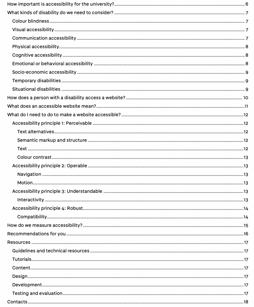
We have created a new website accessibility policy to ensure everyone can understand the requirements for people creating new content and design work at the University.
This document is currently undergoing final checks and approvals but in the meantime, you can see the contents in the screenshot below:
We will publish full details in a dedicated article about the policy in the near future.
The focus on accessibility has been carried through to the development stage of the process, with each component and template undergoing rigorous testing for colour contrast, easy-of-use when using a screenreader, and other ‘best practice’ checks and measures.
Luckily for us, our development partner, Manifesto, are experts in this area.
Designing a design system
A good design system unites people and teams around a common visual language. It defines the approach to design work and provides patterns of design elements that can be reused and improved in a controlled way. It makes design decisions easier.
And the good news is that our very own digital design system is well underway.
The system includes everything a designer needs to create a design that is on-brand, accessible, and consistent. It sets us up for the years ahead so we can realistically achieve a high level of quality in our design work without losing consistency over time.
Pattern library – the heart of the design system
At the core of the design system is a ‘pattern library’. This is a collection of components (bits of functionality like navigation menus, tabs, imagery, etc) and templates for presenting content.
As designers, we can select each component or template in our design tool and drop it onto the page. Developers can select and import the ‘coded’ version of each component. Content authors can drop the same components onto a page and add content. The main advantage is consistency all the way through the process – and consistency for website visitors. Turns out, we’re obsessed with consistency.
The pattern library has been such a massive part of our work that it deserves a whole article to cover all the details. So I’ll hand over to our front-end developer, Ryan, to introduce the pattern library workflow and give you some detailed examples:
Building accessible, mobile-friendly, fast-loading, attractive website components and templates
Is that it for the year?
Time to relax? Maybe rewatch Game of Thrones? Hmm, let me check the project roadmap… ah, no, there is another 2.5 years of work until we’re finished. And then we won’t be finished exactly because a good website is never finished.
That’s the pressure of continuous improvement; we want everyone to have the best website experience possible. We want people to achieve their goal, whatever that might be, faster and without friction (in other words, getting really irritated). And with changing environments, technology, and user expectations, that won’t be easy.
It’s true to say we will never be finished. So expect another update soon…
Thank you for reading.
P.S. You can be part of this project
Please look out for our upcoming user testing sessions.
Our ‘beta’ website will launch in July this year (I know, fast, right?) and feedback from people like you will be invaluable. This is the first chance to share your thoughts on the University of Dundee’s new website and help to help us develop key pages like courses, people profiles, and support guides.
Do you want us to email you when it’s ready? Then jump on our email list and we’ll do just that.
