Awards and accolades on the homepage
Following on from the great news that we have been named the University of the Year for Student Experience by The Sunday Times Good University Guide 2020, we have updated the homepage to highlight some of our major awards and accolades that help to show we are a fantastic choice for students.

Upcoming change to course pages
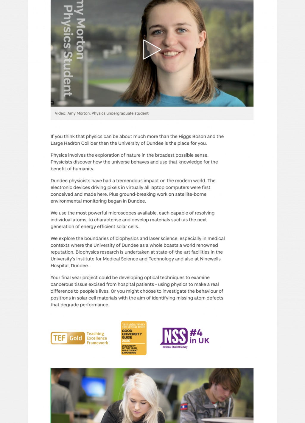
We will shortly be adding awards and accolades to our course pages.

We’re adding a new section on each course page that will display awards and accolades, including:
- TEF Gold
- University of the Year for Student Experience
- National Student Survey ranking (4th in UK)
Placement of awards and accolades
This new section is positioned so that it’s visible to visitors but won’t interrupt progress on their journey towards completing their task. It’s important to understand that each user on our site has a task to complete. That they are visiting us for a reason.
Our top task research identified key tasks relating to course pages. This research (along with design sprints performed with students and visits to schools to get input from prospective students) has informed the course page content and the way we have presented it. The following tasks were in the top ten for applicants for what they want from our website as a whole:
- Check entry requirements for a course
- See the modules for a course and how they are taught and assessed
- Find out what happens after I apply
- Find out about course application deadlines
- See examples of student work for a specific course
That’s five things in the top ten that are specific to course pages from hundreds of things that applicants say they want from our website. These depend on us getting course pages right for our prospective and applicant visitors.
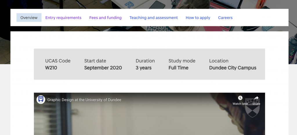
And to get this right, we have added clear, simple, obvious navigation to important content like entry requirements and how to apply.

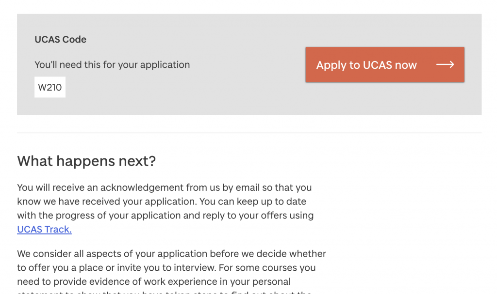
We then present that content in a clear and simple format, using typography, colour, and icons in the right way to enhance the experience. For example, we use background colours to highlight key information:

Staying user-focused
Our new approach to content and design focuses on helping our visitors get things done. We aim to provide useful content that delivers what they need fast and within minimal distraction.
Research suggests that design elements, imagery, and logos for awards or accreditations aren’t typically a specific reason for someone’s visit. Instead, they make up the background of their experience. They are seen more subconsciously than consciously as the visitor focuses on completing their task. Forcing these background elements into the visitor’s conscious could interrupt their journey, frustrating them, and ultimately leading to their exit from our site without completing their task. For example, adding an award logo at the top of the page would push important content and navigation further down the page, especially on mobile devices.
If a visitor leaves our site feeling satisfied and not frustrated, that is a positive thing in terms of our reputation (a key measure of our success). In terms of a prospective student visiting a course page, we definitely want to avoid any feelings of frustration on such an important user journey.
What next
Considering the fact that millions of people view our course pages each year, we expect this task-based approach to have a very positive impact. We are continuing to test with our audiences, measuring the impact of our content and design, and making enhancements based on what we discover.