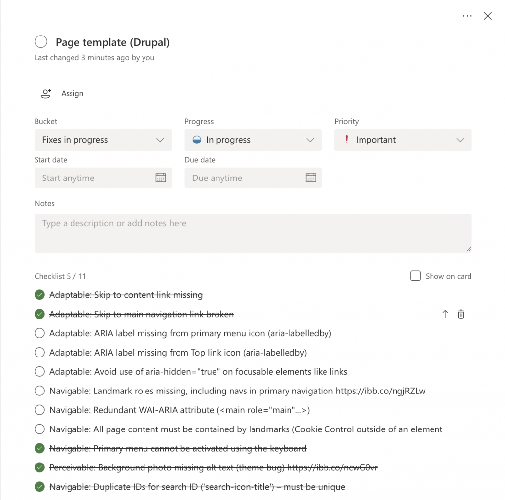
We are working towards ensuring the University’s websites are fully accessible for everyone – and legally compliant – by September 2020.
We aim to make our websites accessible to everyone in the following ways:
- Perceivable: Making text and media perceivable for everyone
- Operable: Helping users navigate content
- Understandable: Making and media text understandable
- Robust: Maximising compatibility
We performed an accessibility audit recently. Performing an accessibility audit is part of the process of assessing where we are not achieving the above aims.
The audit helped us to identify improvements we could make to both our new designs and old templates. We have prioritised the issues and already started to work through them, fixing urgent problems first.

In the interests of full transparency, we publish the issues and provide updates as part of our accessibility statement.
What we have fixed recently
You may notice some of these enhancements:
- the contrast of borders on form fields (such as the input on the search page) has been increased from light grey to dark grey to make them easier to see
- links that are surrounded by text (like within the body of an article) have been underlined – they are now more apparent and don’t rely on colour to be visible and distinctive
- font sizes for some components have been increased to make our content more comfortable to read
- links and icons that appear on light grey backgrounds (for example, in the footer) have been darkened to ensure a suitable level of contrast
- text that appears on top of background images is now more comfortable to read thanks to an increase in contrast

Above: Links now stand out from surrounding body text

Above: Text inputs now have improved contrast
If you are using a device or tool to make the website more accessible (like a screen reader), you may also notice these improvements:
- we added a ‘skip to navigation’ link to make it easier and quicker to access the primary navigation menus
- we updated the primary navigation to be easier to use for people who have high zoom and font size settings on their browser
- we addressed incorrect heading structures on some pages and components (headings are now nested correctly, improving readability and ‘parsability’ by screen readers and similar tools)
- we updated how media items are created in our content management system so that alternative text is required for images used within our content to convey meaning

Above: It’s now easier to skip directly to our primary navigation using a screenreader
Patterns make it easier
As mentioned in previous blog posts, we have built our own design system. This includes a ‘pattern library’ full of components and page templates that we can re-use. And once we fix a component or page template, this change automatically cascades out to all places where it is being used.
Next steps
While the enhancements above will make a big difference, we still have a lot of work ahead to address every issue. We are determined to solve all of these and to ensure that our website is fully accessible.
Please don’t hesitate to contact us by emailing help4u@dundee.ac.uk to inform us about any accessibility issues.