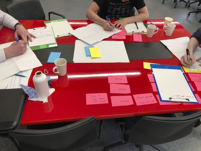
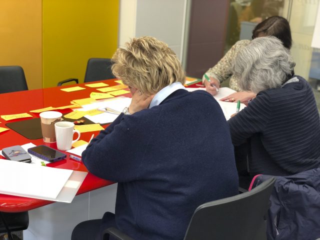
Not sure what a Design Sprint is? These are fun, interactive problem-solving sessions with students, staff, and other key audience members. For more information, read Join a Design Sprint to shape future website experiences
Our sixth Design Sprint took place on 24 April 2018. The problem we came together to solve was: ‘How can we improve the accommodation selection process for applicants?’
The sixth Design Sprint covered our Accommodation. Unlike previous offerings where we’d focussed on designing a new web experience, this was an attempt to take the full customer journey into consideration.
Currently a user can browse accommodation options on the dundee.ac.uk web pages, however booking a room is embedded within the course application. The pages are not interactive as a result, and people can feel they don’t have a connection to booking their new home until the last moment.
Notifications come via email from SITS from a mix of admissions and residences, plus there is interaction within a separate app called Room Service, which is accessed via eVision.
Design Sprints allow us to imagine a complete free canvas, so something that is tricky at the moment due to an internal system can simply be ignored. This lets us come up with a plan of where we want to be, rather than where we may end up in the short term.
The solution
We decided the existing pages were doing a decent job as a static catalogue, so focussed on the journey from the first accommodation related email.
Currently, this is sent once you are able to book a room, so quite late in the cycle as it relies on us knowing the applicants application status. We decided to send an email earlier, introducing a new intermediate step of a shortlist.
The shortlist would be a soft concept on our side as it’s not a final choice, however it gives the user a sense of comfort as they’ve actually performed an action regarding their accommodation. It also gives our residences team a potential overview of what flats will be popular once the offers are applied.
Instead of simply throwing the user into an alien corporate system, we integrated the web back into the solution, so from the email they were sent to the website they’d already looked at. From here they can compare our options and choose their favourites.
A good suggestion, that came from a colleague from IT, was to show features on the filtering even if it was available everywhere. This actually works to highlight that we have 100% wifi coverage, and 100% en-suite rooms.
A smart chat interface was considered for these stages, programmed to interpret questions and answer the vast majority of common queries. Due to the cost of accommodation, there is often a desire to confirm things even when they are directly in front of you. The automated chatbot can provide this reassurance without directly impacting on staff time, only escalating when users are not satisfied.
The accommodation shortlist has a clear notice to remind users they’ve not actually booked a room but lets them know once booking opens. This choice is saved against their Dundee account (via a login) so if they come back they’ll be reassured.
Finally, we move back to emails: the first inviting payment, the second just before they arrive, and finally a post arrival survey to see how they are getting on.
View the prototype
[tribe_events view=”list”]

