We often talk about larger projects on our blog, but sometimes small changes, and what seem like minor tweaks, can significantly improve user experience.
One of our main aims with the new website is to make it easier for people to find the information they need. This is both at an overall website level – so they can search for and land on the right page – and at a page level, so that we are presenting the information in as clear a way as possible.
Our recent work on the salary scales pages is a good example of how we’ve achieved this. These are pages that see a decent amount of traffic (after all, it’s why we’re all working here) and are pages that both current staff and those looking for employment with us are interested in. 2021 saw 16,000 page views for the main salary scale page alone.
Around a quarter of our visitors viewed these pages on a mobile phone. However, the old pages were difficult to read on a mobile device, needing a lot of scrolling in both directions to find the part of the table that was relevant. We don’t want to frustrate our users and waste their time when searching for information such as this. If you were thinking about working with us, it wouldn’t make a great first impression either.
Mobile first
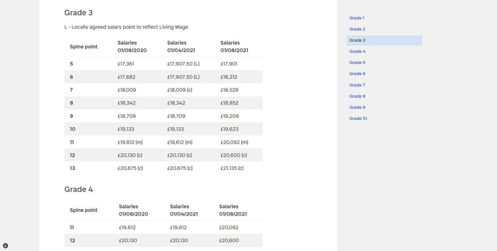
Our new website design is ‘mobile first’. Unlike the old site, we now use responsive design to make sure our content fits the screens of different-sized devices automatically. Mobile users dislike excessive scrolling or zooming when seeking information. Therefore, instead of one extremely long table that needed to be scrolled up and down as well as side-to-side, we’ve now split the content so that people are only looking at the information that is relevant to them.
Rarely, if ever, would staff need to see every line of the salary scale, or even the grades that don’t apply to them, so we have separated out each grade into its own table and under its own heading. This addition of headings means that we now have contextual navigation on the right hand side of the page (on desktop) or in the dropdown at the top of the page (on mobile). This makes it quicker to jump to the pay grade you are interested in.

In line with these principles we have also separated out the footnotes in the table, putting the ones that apply to all users at the top of the page, but keeping the ones specific to certain grades within that section.
For example, the minimum starting point for professorial staff is only valid for those staff members at Grade 10 and above so we’ve only included that information in the Grade 10 section. Contribution points, however, are relevant to all grades, so are explained at the top of the page. The first three grades are the only ones that the living wage applies to, so again this is included only in these tables.

Previously, this extra information had been divorced from the content it was meant to explain, making for additional scrolling back and forth, all of which takes time and makes for a particularly awkward experience on mobile.
A minor but very useful tweak was also made to the tables themselves – striped rows in the table mean that you can keep your place more easily and read straight across the row. We also removed the .00 from the salary figure as it cluttered up the table and reduced the clarity of the information.
Similarly, we have changed the clinical pay scales pages. These were even more complex, and had been particularly confusing, with many different footnotes, caveats, and explanations. Once again these have been put into small tables with the appropriate information given to the user at the relevant point on the page.

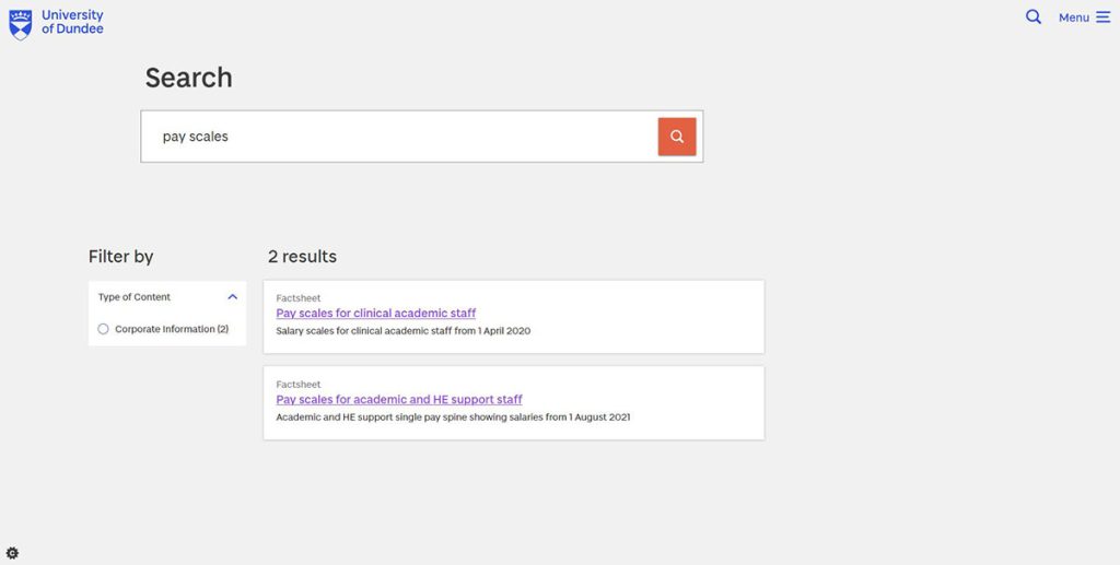
Finally, with the information now in our new ‘corporate information’ content type, and anything that was in a pdf now in full on the website, the content is more easily findable through both the University’s own search:

as well as google search.
To learn more about search and finding corporate information, see Danny’s blog post on Tackling policies and corporate information on the University website.
Overall, when all these small changes are combined, we can see that what seem like a few relatively minor tweaks can make a big difference in the ease of finding information.
You can view the new salary pages below:

