One of the first things many of us do these days when we come into contact with someone new is to google them. In a professional context, this might involve checking out someone’s LinkedIn, or finding their profile on their employer’s website.
In the same way that we use our social media to present our best selves to the world, the University’s staff pages are a way for staff to display their roles, responsibilities, research themes and achievements to a varied audience. Prospective students, researchers, collaborators, future employers, and even the media may all have reason to visit these pages at one time or another. Internally too, they function as a way to find out someone’s contact details and areas of expertise.
The first iteration of these pages provided a page for almost everyone who works at the University (over 3000 people!). Two of our original aims were to ensure that the information on these pages was accurate, and to provide a semantic page structure that Google would be able to index and display easily. These fundamentals haven’t changed: someone landing on your page will see at a glance who you are, which department you belong to, what you teach, and what you research (where appropriate).

Your name, job title, location, and contact details are pulled in automatically from the HR data feed (P3) when you join, and can’t be altered by the Web Services team. This ensures that the information is always correct – if your job title changes, or you get married, then information that HR holds will be reflected on your page automatically. You can add a photo – ideally by attending one of the regular photoshoots – and write your own biographical information, information about your role within the University, research, and teaching.
An example of research content:
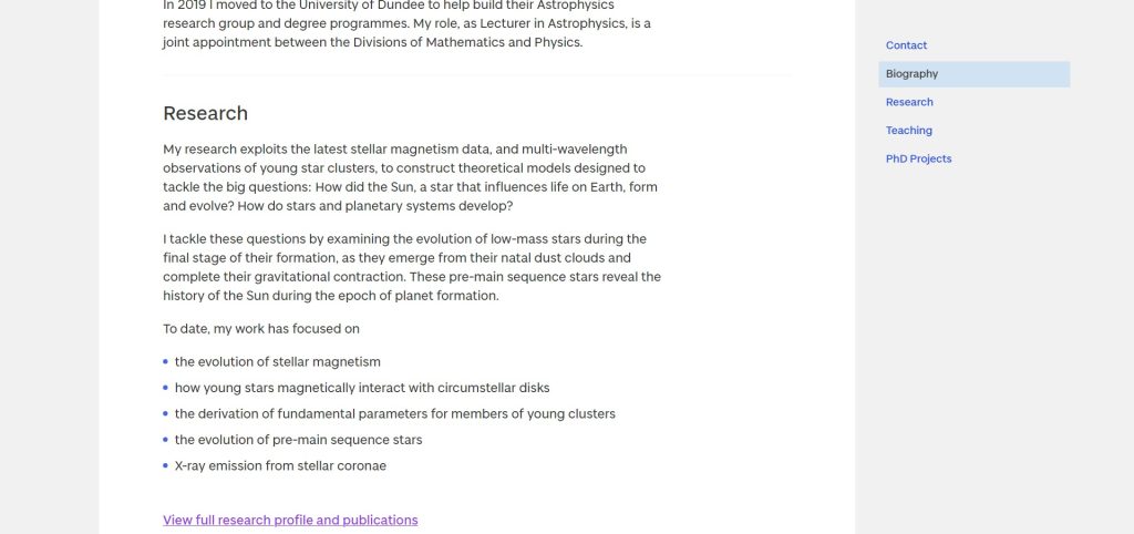
This is really your shop window to explain what you do. Being mindful of the various audiences who could be visiting your page, it is great if at least the first paragraph here is written in a way that someone working in the media, or a school pupil thinking of coming to study here, can understand. You can then go on to provide more detailed content appropriate for fellow researchers/collaborators. You can choose to highlight selected publications here and we can add a link to the Discovery Research Portal so that your most recent publications will always be available. We’ve also added the ’gallery’ element to the pages, so that you can add several images (whether photos or diagrams) of your work or events.
New types of content
Work behind the scenes has opened up new possibilities, meaning that we can now pull different types of content into the page, reusing material that appears on other parts of the website. If you’ve been involved in a press release or feature, received any awards, or are offering any PhD projects, visitors to your page will be able to see this straight away. The really smart thing is that once these feeds are set up, it takes very little effort on either your or our part to maintain. By the use of appropriate tags, we can automatically bring in the relevant content to the page.
Press releases
In the days before a content management system, a link to a press release would need to be added manually – and we’d also be reliant on someone informing us that it had been produced. Now, every time the press office issue a press release, they simply add the name(s) of staff involved and it will appear on your page, together with summary text and a thumbnail image from the story. It’s advantageous when you’re recruiting both prospective staff and students as it can help to convey the image of a vibrant department. It also helps to keep your page fresh and up to date, which is good from an SEO point of view.
A tag here:

Will add the story here:
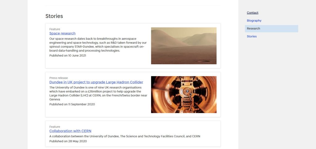
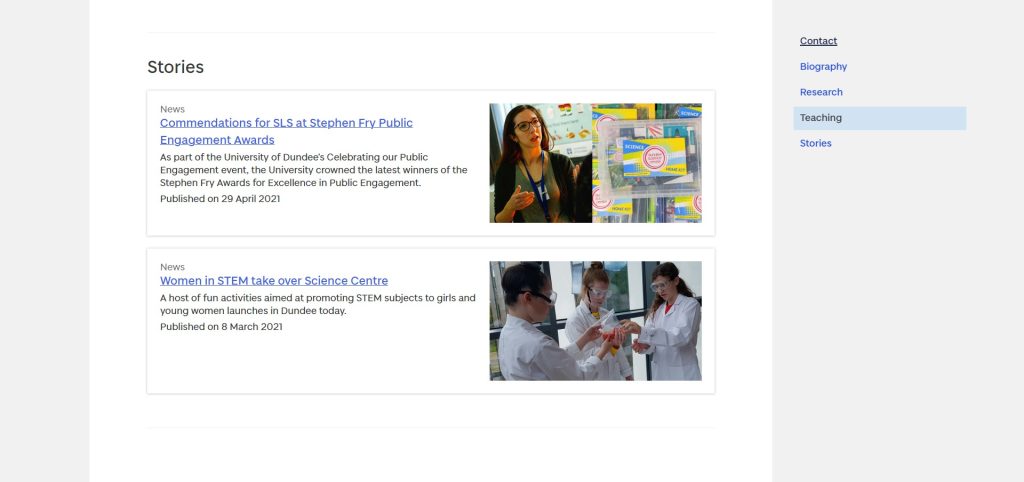
It’s not purely academic members of staff that this applies to either – any member of staff across the University will see relevant content pulled in:
Awards
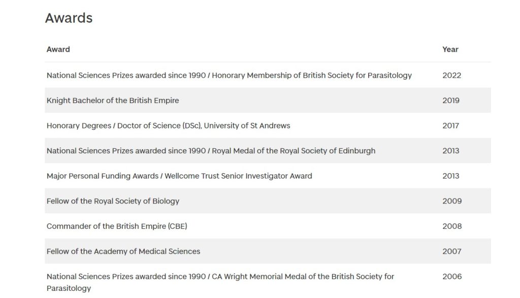
In 2022 we added a feed to display staff awards. This is made possible by our connected content model which contains a relationship between the person content type and the award content type. Awards are tagged with staff members so that these appear automatically on the person’s profile. The original request for this feature came from the School of Life Sciences but has proved to be of value across the University. It is an easy way to demonstrate the showcase the work and achievements of our academics.
PhD projects
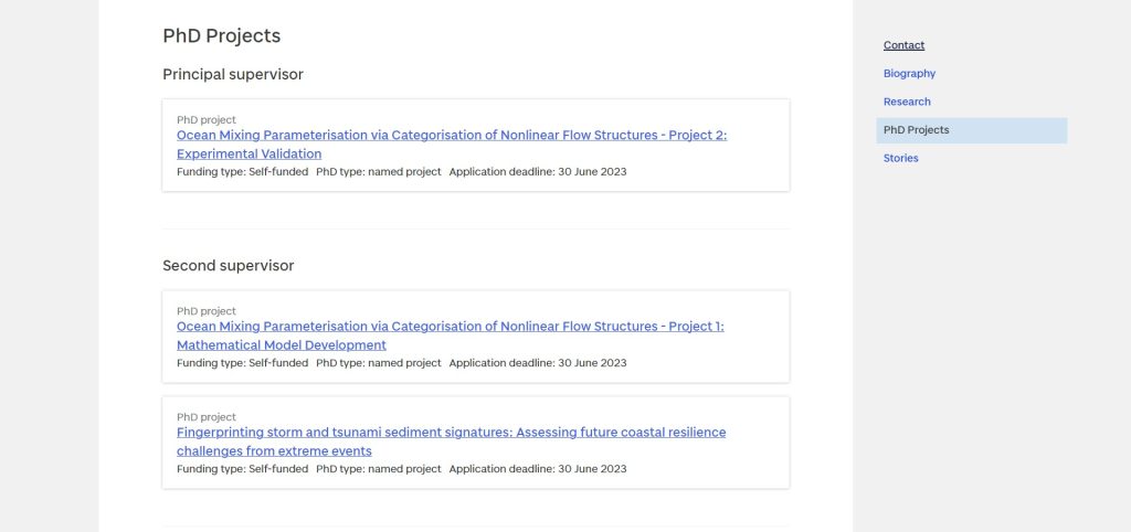
In 2022, we made a further improvement to staff pages with the integration of PhD opportunities where staff members were a named supervisor. Although we have a searchable list of PhD projects, the way that prospective PhD students find these varies. In many instances, a student may make contact with a researcher at a conference, or simply know of their work, look them up, and then find what projects they are supervising directly from their staff page. Personal connections and interests are key here. On the staff page, a summary of the project opportunity is pulled in, and will automatically disappear from the page once the deadline has passed – again, saving a lot of manual checking.
Using staff pages across the website
As well as pulling information from elsewhere on to a person’s profile, we can also do the same thing in reverse – pulling information into a content type that we call a ‘manual person listing’. For school or department sites, all staff in that group get pulled in to the ‘People’ page automatically, as below:
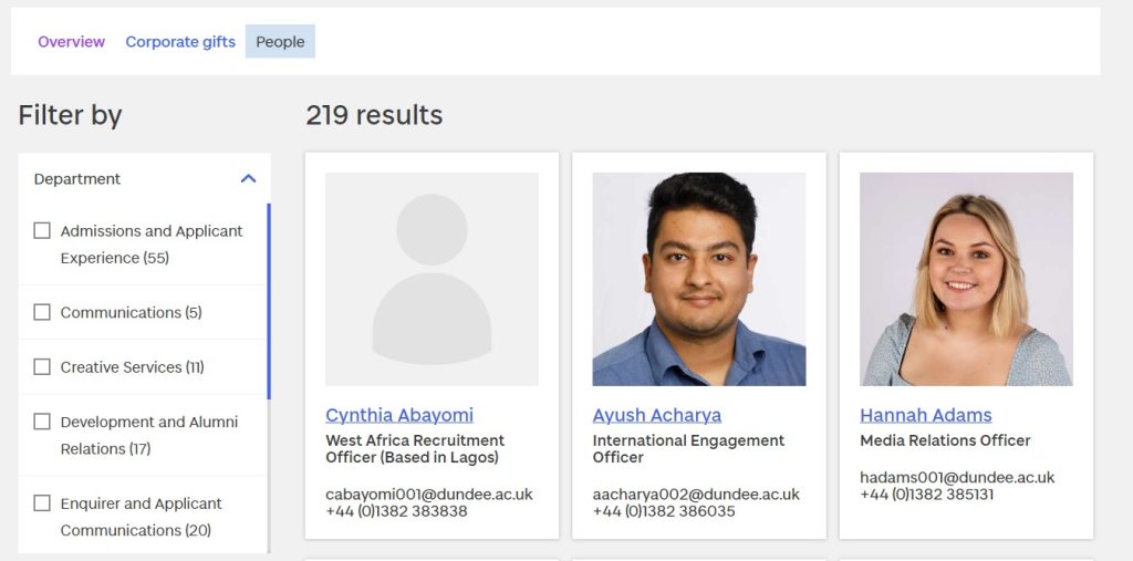
However, there are sometimes occasions where we might want to display a manually curated list of staff – perhaps members of a specific research group or committee for example. As with the development of our awards component, it was work on the Life Sciences website which provided an impetus for this, but it has been valuable across the website.
We are now able to group together members of staff by adding their names and choosing what fields we want displayed alongside them – phone number, email address, or photo for instance. We are even able to add supplementary information such as research interests or a specific role which might not be the same as their job title, but is relevant to the particular grouping. You can see this in the screenshots below:
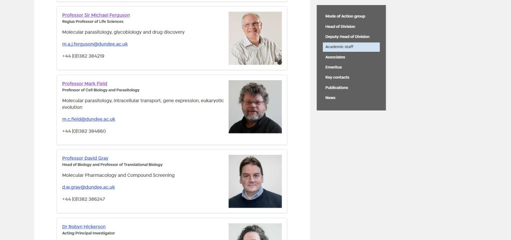
The flexibility here makes this a powerful content type. We can display the information in a variety of ways – either a full card with photos as above, or in a more condensed contact table:
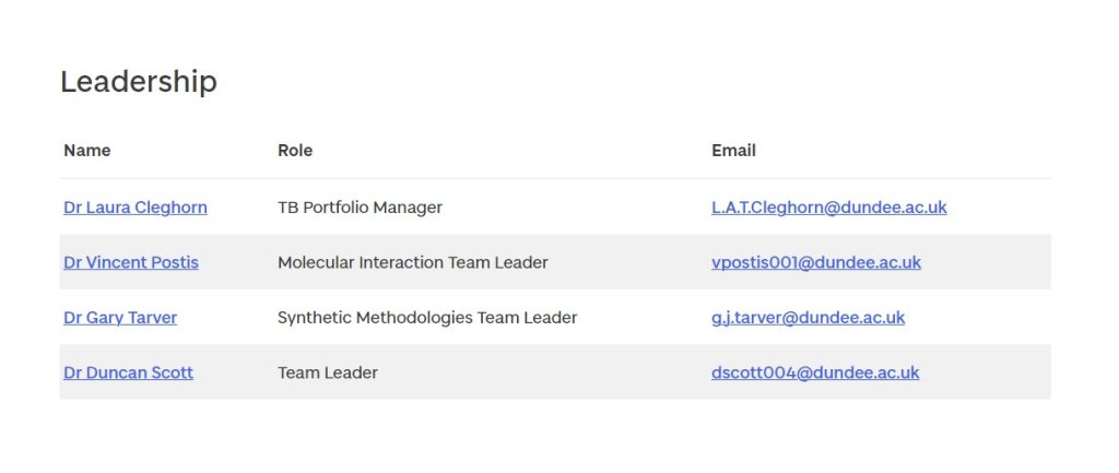
Again, this development leads to lower maintenance for everyone. Although this content type is ‘manual’ in the sense we choose which members of staff are displayed, it is automatic in the sense that staff will be removed when they leave and are no longer in the HR system. This means pages are kept up to date, and users will not be frustrated by coming across contact information which is no longer relevant. It also ensures that human error – typing in the wrong digit of a phone number for instance – is reduced, since the central database is being used.
Overall, the work we’ve done over the past couple of years has been of huge importance in connecting, reusing, and surfacing different types of content across the website, as well as reducing maintenance overheads and improving accuracy. The staff pages are just one area which highlights the interconnected nature of our content and how we can use each bit to maximum advantage and ensure both you as staff, as well as our external users, can derive as much benefit as possible from it.
If this post has got you thinking about your page, and you want to update the biography, research, or teaching content, read our guide on updating your details.
