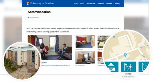
Accommodation is a great selling point for the University of Dundee, we have around 250 self-contained flats, the majority of which are on or around the city campus. Therefore, alongside our revamp of the course pages on the Study website we set about updating the Accommodation site.
Due to the way university applications work, applying for a room is more complex than just booking a hotel. You need to be holding an offer, then we’ll contact you, then there is an allocation procedure to try and match students up with students they’ll get on with. As such the old accommodation site was designed with the aim to guide applicants through all the information they need to know. This was a noble aim however the inherent assumption was that users would follow the predefined route – Ikea style – from start to finish.
If you’re a listener to Radio 1 you may have heard phrases such as “to find out more, search Newsbeat Elections”. Users are now accustomed to searching for everything, whether that’s typing a set of keywords into Google or asking Siri where the nearest café is. The days of spending over a minute to read a URL out on TV are long gone. Navigation is dead; long live search.
Many of the changes that were made to the Study website were based around catering for the fact most applicants will land directly on a course page from a Google search. Whilst the left hand navigation was always available on Study, we found that the sheer amount of options was confusing.
Applicants will often research universities on external websites, with peer review being very highly rated as opposed to our advertising materials. After all, a university would never put “you’ll hear the sound of the bypass from your bedroom” on their own site. Thankfully Dundee’s accommodation is rated really well on these websites, but the by-product is that applicants already know the words “Heathfield” and “Seabraes” early on.
The reason this matters is because the entry point to the website will often be from a search such as “Dundee Uni Heathfield.” Navigation is not dead, it’s just you have to work out where people land and design the navigation to work from there.
The user starts where the user starts
With this in mind, we worked to make the pages for the individual flats better as landing pages, as our analytics suggested this was the starting point for many users. However just changing the starting point doesn’t change the original problem – that there are a myriad of contracts and many different user groups who are landing on the page.
Previously we had tried to funnel each of these user types – postgrad, Nursing students, Erasmus exchange, continuing student – into their own separate section of the site. Over time, as it was realised users were missing information they needed to know, more pages were added to try and help them. Unfortunately, what this caused was a great deal of duplication, plus it caused the site to balloon to over 60 pages with three distinct levels of navigation.
The solution was therefore to ensure that no matter what type of user you are, you always had the information available without having to go to several other pages. The tricky part was how to do this without overloading the pages.
A major part of writing for the web is to unlearn the golden rule of primary school English, “answer the question with a sentence.” People skim web pages, scanning around for a cue that suggests they’re in the right place, before starting to read properly. Therefore, having a large number of full sentences can work against usability.
Replacing sentences with icons gave us three benefits:
- They allowed us to highlight key selling points of our product
- They prevented these points being lost inside redundant words needed to make a proper sentence
- By breaking up the style of the page they help prevent users from becoming tired reading screeds of text. When the user does come to a paragraph it’s a novelty making it more likely to be read.
We also considered the more common user case. By trying to treat everyone equally we were doing a disservice to the majority of applicants: first years who take the 39-week contract. We made this contract more prominent whilst ensuring the other contracts were still clear for those customers who were interested.
Apply Now
As previously mentioned, getting a room in our accommodation requires an offer, yet we get hundreds of queries every year from applicants who don’t realise they can’t just go and book their room like a hotel. We changed our previous five pages to a single “How to Apply”, and put an easy to follow set of steps to clarify they need to apply for their course first.
We continued this page with information for applicants with disabilities, an explanation of how they’ll be allocated a room and how they need to accept. By placing this information in the one place we believe it’ll make it more obvious and show it as part of a single procedure.
We also created a single section for Moving In, to help plan the big day where our students arrive. Every year people turn up with too much, or forget essentials so we tried to put all the hints and tips in once place.
Moving between these pages is a case of having a large button at the bottom of the previous page with a clear call to action. This simpler navigation, mixed with reducing the total number of pages by 65% is designed to help all users find everything they want to know, plus everything they need to know, no matter how they arrive on our site.


