Earlier this year, the undergraduate student prospectus was updated. The marketing and design teams worked with an external agency to give it a contemporary look and feel and to ensure it fully showcased the student experience. The resulting prospectus looked fantastic – it was vibrant, written in a friendly tone, included a variety of student voices, and featured high quality photography which really showed off the campus and city to their best advantage.
Compared to this new prospectus, our campus and city webpages were looking rather drab and uninspiring. Some of the information we had on the pages was out of date, and the structure needed to be revisited. It was fair to say that this part of the website was badly in need of a makeover!
Why are these pages important?
Students already at Dundee are overwhelmingly enthusiastic about what the campus and city have to offer, and we regularly come top in surveys on student experience. This is great, but we need to make prospective students aware of this – people outside Scotland claim to know little about the city or the University and often don’t consider it to be a particularly enticing destination. These pages are our opportunity, as with the prospectus, to showcase Dundee to the world.
We also need to consider that for some prospective students, particularly those overseas or who might come in through clearing, the webpages may be their only real ‘experience’ of the city before they travel here in person to begin their studies.
Although traffic to these pages (~175,00 views in a 12 month period) is only a small percentage of views to the /study/ section, it is arguably looked at by more ‘serious’ applicants who have already ascertained that we offer the course they are interested in, and that they have a high probability of meeting our entry requirements.
What did we aim to do?
- Restructure the pages and remove redundant content
- Rewrite, add to and update the content as necessary, including more eye-catching photography and video content
- Make greater use of student-derived material
- Include a call to action to assist in student recruitment
Restructuring the pages
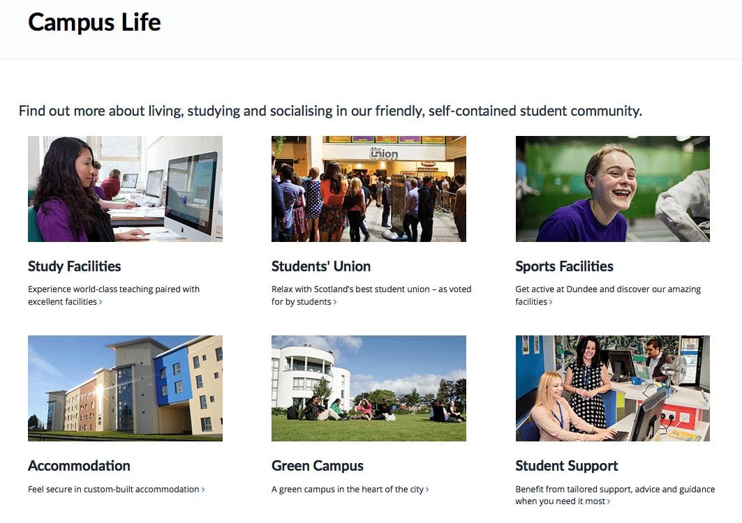
We organised the content into two separate categories, city life (one page only) and campus life, comprising several pages on different topics.
We are trying to streamline content across the University website, cutting down on repetitive and/or redundant content. With that in mind, descriptive pages about the accommodation and student services websites were removed and we linked directly to the site in question, thus cutting out a step and providing a simpler navigation for users. Other pages that had been accessed less than 1000 times in a year were also removed.
Removing left hand navigation
We chose to remove the left hand navigation from the pages. It was underused and served little purpose, other than to distract users when reading the main content. Its removal also meant that we could use the entire space for content and gave our pages more of a magazine style feel.
Updated and rewritten content
Tone of voice
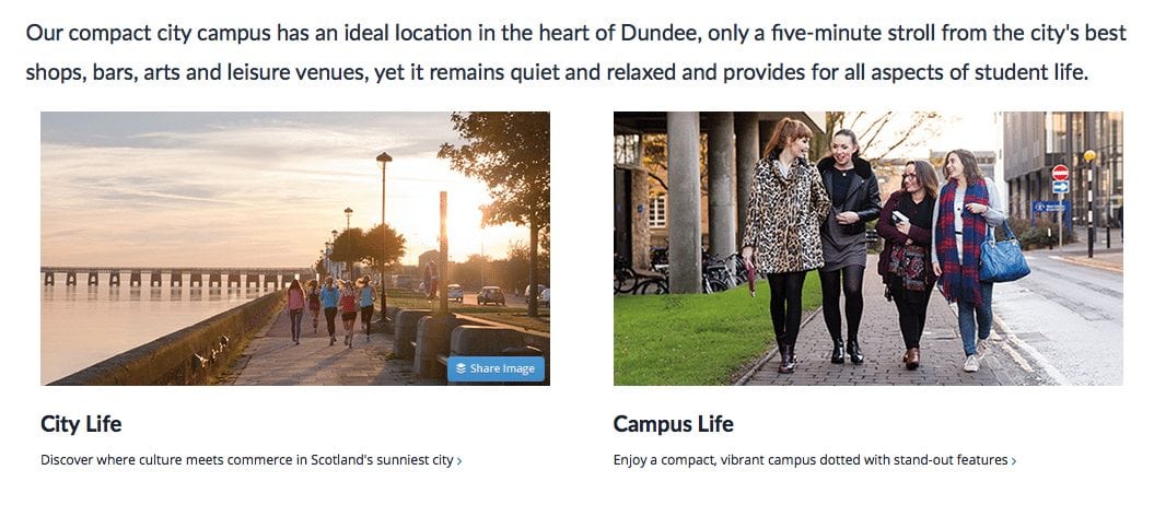
As with the prospectus, we wanted to make sure that the pages would appeal to prospective students, and so adopted a more casual and friendly tone of voice:
City page
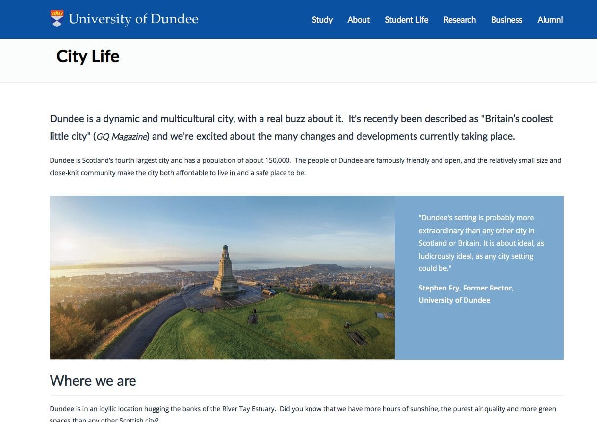
One of the pages we changed substantially was the city page, researching and updating the content to take into account the city’s many recent developments and accolades.
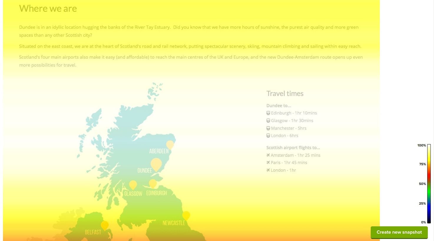
We began by showing the visitor exactly where Dundee was, using a map taken from the prospectus, together with some approximate travel times to highlight the fact that it is easy to reach from many areas of the country. Prospective students appear to have welcomed the inclusion of this; the heat map below shows that almost all visitors to the page paused to take a look at this content.
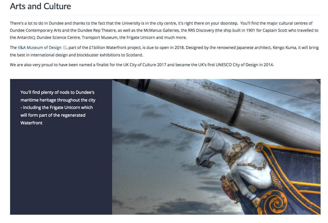
Rather than going into too much detail about the other topics on the page – Art & Culture, Nightlife, Food & Drink, Shopping, and Parks & Recreation – we kept the content fairly short, believing that prospective students would turn to other sources if they wanted to explore these in more detail.
Instead, we painted a broad brush picture highlighting the tremendous variety of Dundee’s offerings. The restaurant scene, for example, has improved tremendously in recent years, adding to the multicultural flavour of the city, and we are also now beginning to feel the impact of the Waterfront transformation. Indeed, change is happening so fast that even during the relatively short period of gathering the content for the pages we were aware of new developments to Dundee’s social scene.
In keeping with the more magazine-style format of the pages, the written content was broken up by bold and vibrant images. Removing the left hand navigation gave us the opportunity to create a real impact on the page with some outstanding photography. Some images were taken from the prospectus, but others have not yet been used elsewhere, and they combine to create an impression of a unique, vibrant city, which has something to offer all tastes.
Campus pages
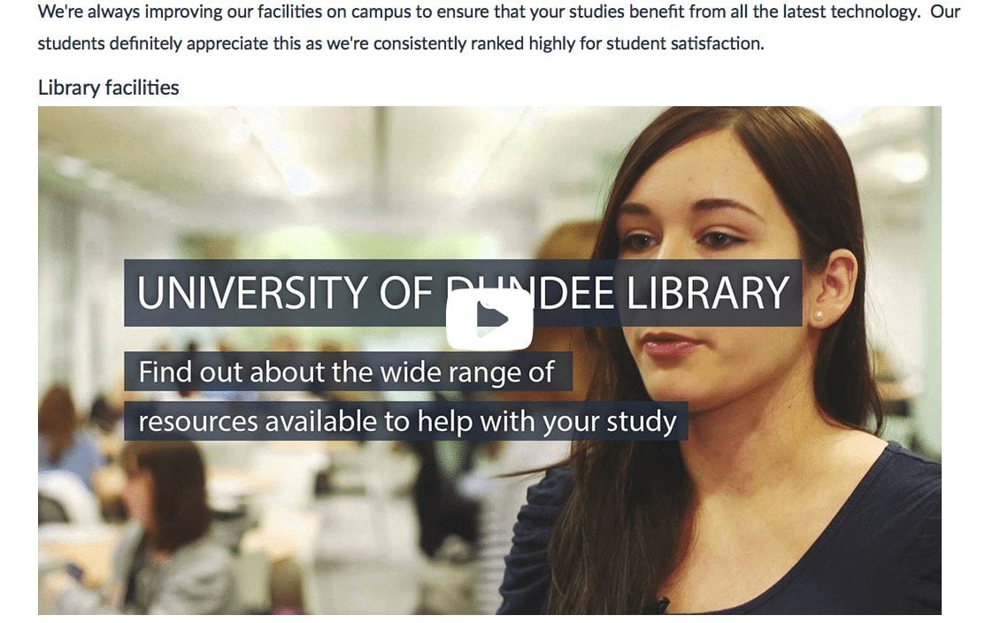
As with the city page, the set of campus pages also made much greater use of photography and particularly of video. Each campus page begins with a brand new video containing highlights of the facilities offered, together with headline text so we could immediately convey key messages.
We also tried to identify unique and interesting facts about places such as the library – obviously all universities have a library, but what makes ours stand out? We thought the specialist laptop lockers, where you can charge your laptop while it’s being safely stored, were a bit different!
Green Campus
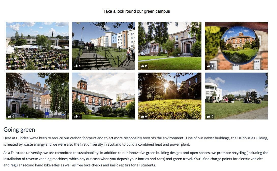
The inclusion of a page about the green campus is a new addition and serves two functions. Firstly, it shows prospective students just how much green space we have on campus, something which many find surprising, considering we are in the city centre, and secondly, draws attention to our green policies. Environmental issues are becoming ever more important to prospective students, and our track record on these matters is certainly worth highlighting.
More student-derived content
As with the updated course and country pages, we have included student testimonials, both as part of our videos and as written content:
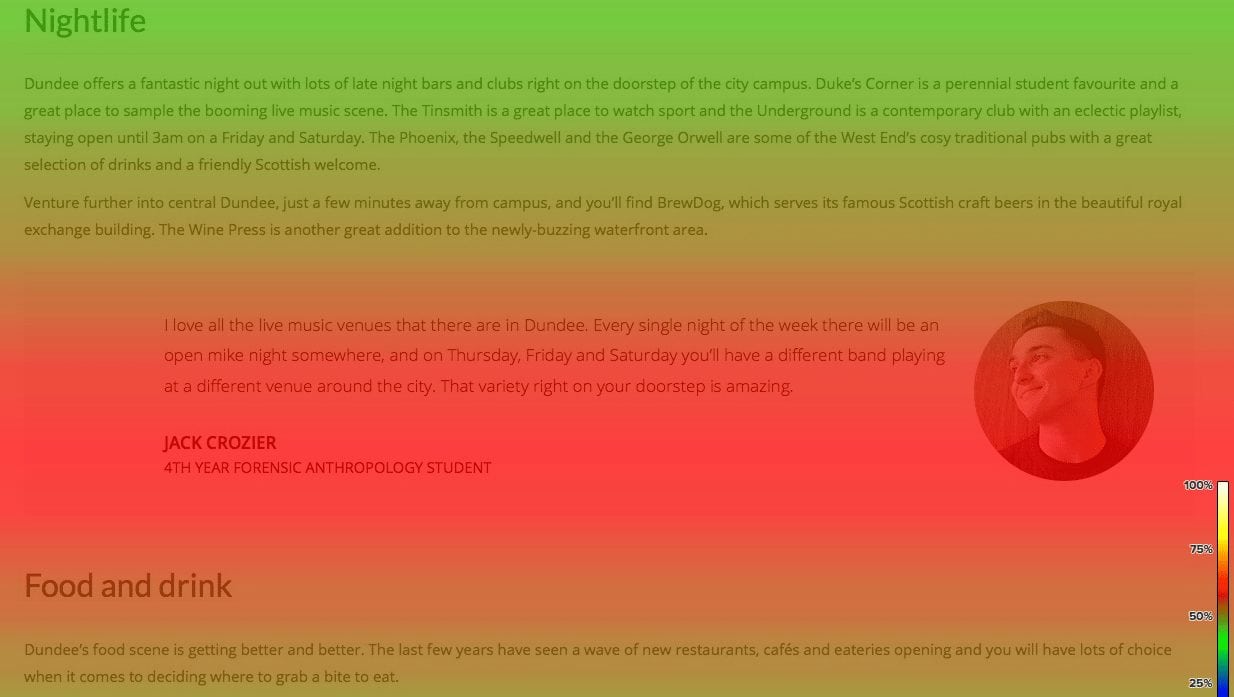
We have always believed that this type of content appeals to prospective students, and this assertion is supported by the tracking software we have installed on the pages. The heatmaps produced show that users do pause to read this content even if they are scrolling past some of our text.
Call to action
Finally, we considered our calls to action – the purpose of these pages is to encourage students to apply to the University, so what would be their next logical step? On the bottom of each page, we have included calls to action – once a prospective student has read the content, and hopefully liked what they have seen, we want to encourage them either to visit the campus for themselves (if possible), or if they are from overseas, to find out more specific information about life in Dundee for students from their home country. Links to attend an open day and country specific information are therefore included at the bottom of every page.
Measuring the impact of our changes
These pages have not, in the past, seen particularly heavy traffic. It’s too early to say right now whether our changes have increased the number of visitors, as we need to collect more data over time. However, even in the last couple of weeks, we can see that when people reach these pages, the time spent on them is generally very good:
- City life – 2:50
- Union – 2:25
- Sport – 1:49
- Study facilities – 1:42
- Green campus – 2:04
As mentioned above, we can also see from the heatmaps that users are pausing at parts of the page which interest them – such as the map and the student testimonials.
We also need more time to judge whether our calls to action have worked – there are certain times of the year which see more traffic to these pages than others – but initial findings are promising, with users from around the world particularly interested in clicking through to our set of international pages.
Future plans
We will continue to monitor the way users are interacting with these pages and make improvements based on the data. We will also ensure that these pages are regularly maintained, so that the information remains current.
Additionally, we have two main projects underway which will complement this set of pages. The first, building on the idea that prospective students want to see as much as possible about the University, is to incorporate a 360 degree virtual tour. This is something that many universities have already developed to great effect, and something which will be of interest to all prospective students, but particularly those coming from overseas who may not be able to visit in person.
Secondly, since we know that our users show interest in the student testimonials on the website, we are planning to resurrect the student blog, giving 12 students the opportunity to blog about their day to day life here in Dundee. Whilst the isolated testimonials and quotes work well on the appropriate webpages, they are limited in that they don’t allow a user fully to connect or form any sort of relationship with the author. The blog aims to fill that gap as it will follow a student’s journey through university, navigating the ups and downs of student life and enabling the reader to identify with the student blogger.
We’re hoping to get this blog up and running by the end of the summer, so keep watching this space.

