One of our current projects is to create a smoother and more streamlined user journey for prospective students who are researching, deciding on, and applying for, PhD opportunities. Ultimately, this should contribute to an increase in high quality PhD applications to the University, and encourage students to choose us rather than our competitors. However, it’s a complex process, and so in order to learn more about it, and the challenges users face with our current site, we embarked upon some user testing. Without this step, it can be easy to make assumptions about what people need.
Why do we carry out user testing?
User testing is really important to us because it provides invaluable insights into how real people interact with our content. It enables us to identify usability issues, gather feedback on readability, and understand the overall user experience. We learn so much by speaking to the different groups of people who use our site and can then use these findings to refine or restructure our content.
How we went about it
We wanted to investigate how users approached the issues of choosing a PhD, and how easy it was for them to find essential information about research options, fees and funding, entry requirements, and how to apply. What were the obstacles when they interacted with the website and could they clearly understand the process from start to finish?
We carried out the testing over Teams with seven users who were at various stages of their own postgraduate journeys – from studying for a Masters degree to being in the middle of a PhD. Although seven might seem like a small number, previous user testing sessions have shown us that insights tend to crystallise after speaking to only five or six users.
We presented each user with four main scenarios and asked them to talk through what they were doing as they searched for the information. An example scenario was:
- You have studied cell biology at undergraduate level and hope to continue with a PhD in this area. Find the relevant projects that are available to you. Pick one and tell us what your next step is based on the content.
- Is there funding available for this project?
- What are the entry requirements?
The users shared their screens with us so we could see exactly how they were navigating through the site. They started on a browser of their own choice, on the google homepage. Using Teams meant we were able to record what the user was doing, and also meant they were accessing the site in their usual way, from their own personal device, rather than in unfamiliar lab settings
Just to keep things interesting, there were some challenges to the testing. We had a student using a mobile from Nigeria with limited bandwidth, another student on a slow connection on a train, and a third who was very difficult to hear. However, these all represented real life situations and we gained useful feedback regardless.
What did we find out?
The findings were fascinating and shattered some more traditional views of how a user might navigate through the content.
One of the first things we noticed was that students do not navigate through a webpage in the way we’ve often envisaged. For the postgraduate research section of the website we had created a landing page which explained the different types of postgraduate research degrees, linked to the PhD opportunities, research areas, and a guide on how to apply. Our original belief was that users would begin here, and work logically through the content to achieve their goals.
However, the results of our user testing showed us that students certainly do not approach the journey in a linear manner but will jump in at different stages and at different places on the website. In most cases, when trying to find a PhD opportunity, they generally bypassed the main landing pages for postgraduate research and so missed the key information contained in the new application guide.
Similarly, the PhD project feed was not a popular way into the site. Students were more likely to browse School pages, use the external website findaphd, google specific topics, or have made contact with an academic in the field. Indeed, as a couple of students explained, networking with academics had been their first connection with the University. They would then look up the academic online.
In this respect, our site functions well – the PhD opportunities listed on a staff member’s profile page were welcomed, as was the ability to explore more about the academic’s research interests via a link to the Discovery portal. Less easy was knowing what to do if you wanted to submit your own topic as a research proposal. Although we do have information on this, many struggled to find it and said they would directly reach out to an academic via the School people pages instead of contacting the named individual on the research areas page.
Finding fees, funding and entry requirements
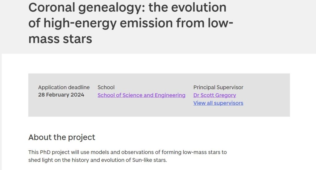
When our users had identified a PhD opportunity, finding the fees, funding, and entry requirements for it proved to be challenging. Although the funded status of a project – whether it is self-funded, or funded by a programme – is shown on the project feed, if you arrive directly on to a project page it is less obvious:
Project feed

Project page

On a programme webpage, funding often appeared lower down on the page than a user expected. We found students were very disinclined to scroll, or to use the contextual navigation to jump to the relevant part of a page. This was also easily missed on mobile.
Although we’ve always understood that users don’t like to scroll, it was amazing to see just how pronounced this behaviour actually was. We frequently tell people that our users will scan through text rather than read it word for word, and watching the users interact with the site absolutely backed this up. It means that it is vital we keep the copy as short as possible so that as much information as possible is visible without too much scrolling.
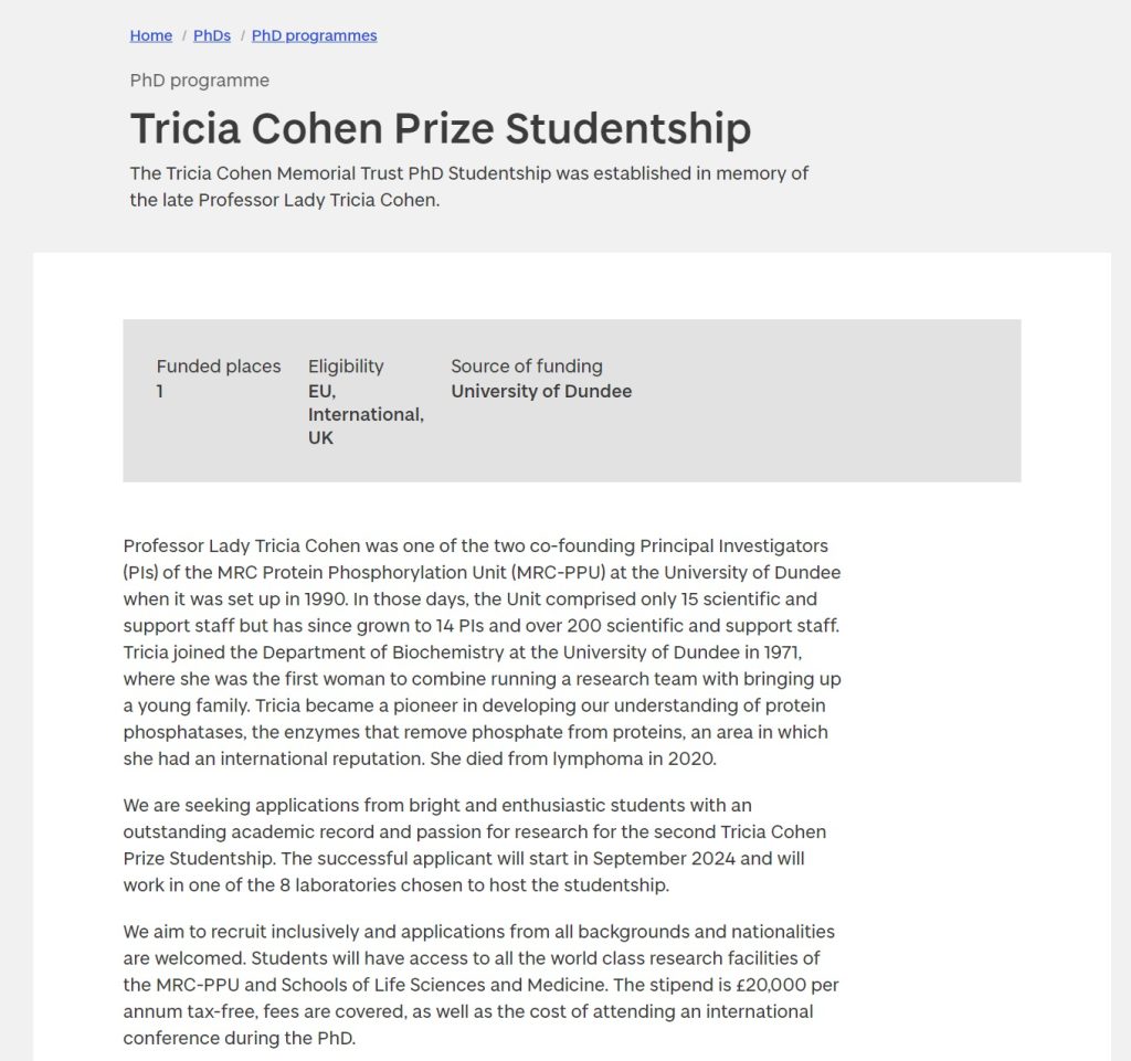
One example of this is the Tricia Cohen Prize Studentship
which several students found when looking for the Life Sciences PhD opportunities.
However, the page begins with some lengthy text on the background to the award, leaving the crucial information about the funding until last. Because it was not clearly set out, students failed to find the information needed. Again, we can make some easy changes here to improve their user experience, simply by restructuring the written content:
Old version of programme page

Improved version of programme page

Entry requirements and fees also proved challenging, since users needed to navigate away from a project page and look elsewhere on the website for these. Fees were the easier of the two, with most eventually finding the table of fees, and then navigating to the specific one they needed.
However, with entry requirements, especially in the case of some of the Life Sciences projects, users ended up circling around in a loop and became increasingly frustrated.
When we moved on to the scenario where we asked users to find similar information about a professional doctorate, they found it much easier. The professional doctorate pages are set up in a self-contained manner, like undergraduate course pages, with separate tabs for fees, teaching, and entry requirements.
Overall, students really appreciated the clarity, structure, and ease of finding information here and some commented that the PhD projects should be set up similarly. This section of the site also worked well on mobile and had a straightforward journey from one stage to the next.
“Site is quite engaging….takes me from one stage to the other”.
What does this mean for the website?
We have learnt from the user testing that essentially every page on the postgraduate research site needs to function as a landing page. Entry requirements, fees, and funding all need to be clearly shown on PhD project pages so everything is in one place rather than expecting the user to hunt for more information. This, however, will require development time and won’t happen straight away, so we have also considered some of the easier improvements we can potentially make to the pages.
In the short term, extra guidance needs to be provided to all PhD project creators to ensure that the information is presented clearly with the key facts prominent at the top of the page, and the yellow ‘apply’ box is as clear as possible, containing brief steps in bullet point form rather than wordy content in a lengthy paragraph. Similar guidance needs to be provided with regard to programme pages.
Since funding information seemed difficult to find, a fairly simple change would be to include the nature of funding (as in the project feed card) at the top of a project page, perhaps in some kind of key facts box, so that users who land directly on a project page get the information they need straight away.
There also needs to be more easily available information about self-funded projects where the student comes up with their own research proposal. One easy change we have already made as a result of the user testing was to rename a page under the School of Medicine website to ensure it wasn’t harming us from an SEO point of view. Its title implied it contained information about self-funded PhDs which applicable to the entire University so it had been ranking highly in google for more generic searches, even though it specifically pertained to the School.
Also from an SEO perspective, our goal includes minimizing the current number of landing pages on the site to avoid conflicting results in Google searches and to reduce confusion among users. We’ve already been experimenting with cutting down pages and trying to simplify the site.
Finally, while user testing has provided valuable insights and highlighted potential improvements for a positive user experience, it’s essential to acknowledge the complexity of the underlying process, especially considering the diverse approaches to postgraduate research from the different Schools within the University. Addressing fundamental issues at this level is crucial before we can truly enhance the prospective students’ experience, as the website alone, while one part of it, does not work in isolation.
