I’ve covered the background to this research in my post about what prospective students want from our websites.
The results!
Top ten tasks
We received 831 responses to this experiment.
| Position | % of participants rating it in their top ten | |
| 1 = | Check my University email | 67% |
| 1 = | Login to My Dundee | 67% |
| 2 | Login to eVision | 54% |
| 3 | See a list of module/coursework deadlines for the whole year | 52% |
| 4 = | Find out when and where classes are | 45% |
| 4 = | Search for something at the library | 45% |
| 5 | Get a list of exam times and locations | 44% |
| 6 | See the modules for a course and how they are taught and assessed | 39% |
| 7 | Find out the grades I need to pass a module | 33% |
| 8 | Find out what is on the reading list for a specific course | 32% |
| 9 | Find out about career opportunities after I graduate | 28% |
| 10 = | Access a recording of a lecture | 25% |
| 10 = | Find out more details about a course | 25% |
| 10 = | Find the email address for a staff member | 25% |
Current students are a harder audience to fully deliver a solution to as many of the tasks they highlighted span multiple different systems and directorates. The main corporate website will be able to deliver some of these solutions but perhaps not all. What interests me most from the research we’ve conducted is that students don’t understand who is responsible for what information, they just want to be able to “do stuff”, and really don’t care who provides that information.
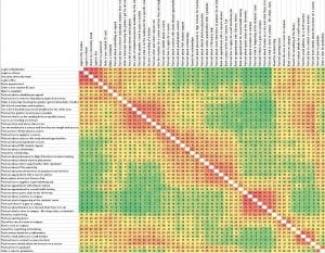
Similarity Matrix
This looks really confusing to start with, but is a very effective way of displaying the information. Essentially it shows how often two tasks are grouped together. The redder the box, the more it has been grouped together. For us as designers, it helps us determine what people will look for in similar locations, so we can implement designs that cater for that desire.
We had 424 responses to this task.
What’s next?
The study hasn’t quite completed yet as we want to give as many people as want to respond, the chance to do so. However we’re already starting to analyse what is coming in and design some early concepts.
In the coming weeks we’ll be releasing some posts where we look at these early concepts for parts of the site, based on this feedback, so you can see how we’re using data to give people what they want.
