I’ve covered the background to this research in my post about what prospective students want from our websites.
The results!
Top ten tasks
We received 57 responses to this experiment.
| Position | % of participants rating it in their top ten | |
| 1 = | Find a staff member’s details (phone number, email, location) | 65% |
| 1 = | See who works in a school/directorate and what their roles are, including their organisational hierarchy | 65% |
| 2 | Log in to apps (email, Box, My Dundee, etc) | 63% |
| 3 | Find and read policies in a simple, easy to use format | 46% |
| 4 = | Book a room online | 44% |
| 4 = | View and book my annual leave | 44% |
| 5 | Browse and book OPD courses | 40% |
| 6 | Report a problem to IT | 39% |
| 7 | See what rooms are free easily | 33% |
| 8 | Find a location on the campus map with directions on how to get there | 30% |
| 9 | View the university calendar, showing committees, working groups, etc | 28% |
| 10 = | Find where someone’s office is on the campus map | 25% |
| 10 = | Report a problem to Estates | 25% |
One thing that perhaps isn’t conveyed clearly by the above, but came through really strongly in the workshops and raw user stories, is that staff overwhelmingly just want “one place” to find information on people and policies, and they don’t care who gives it to them.
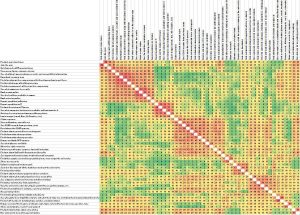
Similarity Matrix
This looks really confusing to start with, but is a very effective way of displaying the information. Essentially it shows how often two tasks are grouped together. The redder the box, the more it has been grouped together. For us as designers, it helps us determine what people will look for in similar locations, so we can implement designs that cater for that desire.
We had 42 responses to this task.
What’s next?
The study hasn’t quite completed yet as we want to give as many people as want to respond, the chance to do so. However we’re already starting to analyse what is coming in and design some early concepts.
If you’re not part of our subscriber list, and would like to participate in the study, then let us know at help4u@dundee.ac.uk.
In the coming weeks we’ll be releasing some posts where we look at these early concepts for parts of the site, based on this feedback, so you can see how we’re using data to give people what they want.
