So, three years ago, we moved course pages into the CMS from their former home on our good old-fashioned artisan web server Sky. After that was completed, we began moving Studying Abroad from its three former homes into one.
It went horribly wrong
This is the story of what went wrong, why it went wrong, and how we fixed all the went wrongness with the brand-new web pages that launched last week. It’s also a tale of how a service that’s always been an afterthought on web has become a forerunner for some of the things we want to do as part of the relaunch project.
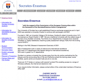
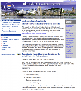
In 2000 there was one page. By 2005, ERASMUS/Socrates and Transatlantic Student Exchange had split into two microsites. By 2014, a third site had appeared for some reason under international admissions. It was a mess.
The 2014 plan:
- We should return to having a single site rather than two and a half.
- You shouldn’t have to worry about which structural exchange programme you’re going to use while choosing.
- It should match the new course pages in design because it’s about studying.
- It should be nice and easy to choose which country you want to go to.
So, what went wrong, and why?
- Not merging the old sites
We just sort of shoved them next to one another but they were still separate for Erasmus and non-Erasmus. - It’s not really part of /study
We’d built Studying Abroad with the idea that “it’s all studying, it’s all admissions”. This meant it shared many of the design features of the rest of the study section. However, many of these were utterly irrelevant. If you’re a current student looking for an exchange, the course finder doesn’t need to take up a significant part of the screen. Plus, the left-hand navigation bar was shared with Undergraduate, meaning it was cluttered with loads of pages that, again, were not relevant to the audience. - Building the site back to front
Turns out that exchanges are based on subjects. We don’t have any computing exchanges in France, so a computing student looking at the French partners will end up disappointed. - Starting too early
By the time we realised the rather crippling flaw in number 3, we’d built most of the site. Plus, having spent so long on it whilst trying to understand it we were constantly rewriting and tweaking. This meant we were at a point where if something changed for one partner we’d need to update it in five places. - Two years of tinkering.
After we launched, we spent two years trying shoehorn fixes into something that was rather flawed. It wasn’t easy, and coupled with the complexity of the back-end, we only things worse. Curiously, by the very last version even the logo had tried to escape.
Fixing things
Determined not to make such mistakes again, I began planning the replacement long before we had any capacity to actually implement it.
The structure of the site needed to reflect the user journey for whichever user was on the site. Instead of splitting the site between Erasmus and non-Erasmus, the split was between Dundee students, and those wishing to come here.
For a Dundee student, it’s the course that’s key. We built a filter system similar to scholarships / room bookings searches. Our computing student therefore only sees the 29 partners relevant to them, rather than the full list of over 110.
They can also filter based on language, so if they’d prefer to be taught in English, it takes away the two Italian partners.
For an incoming student, we retained the country list, although we expect most to arrive directly on the partner page, either from Google or their own institution.
Our new partner pages are much more focussed on showcasing the University of Dundee, with student testimonials, photos of accommodation, and the ability to show modules for their subjects.
That’s great, but what about the maintenance?
To ease the maintenance burden, we reduced the number of pages from 267… to 266. So after this not exactly stellar reduction in content, how are we going to make sure our partner lists don’t go wrong again?
If you were paying attention, you may remember I mentioned that we had to update partner info in five places:
- Update AGN record on SITS
- Update outgoing HTML page on Sky
- Update incoming HTML page on Sky
- Update outgoing content section on T4 CMS
- Update incoming content section on T4 CMS
Even after the old Sky sites were removed, meaning we were down to three pages, it was still difficult. Pam or Karen updated SITS, then we’d then get an email request to fix the website. The requests are often complex (partners wishing to change their name to an Anglicised version, changes from partners with similar names, problems with accented characters), plus they’d come in thick and fast and it was easy to get mixed up. By the end of the old site, hundreds of emails later, we noticed we had several missing partners and others that should have been removed still live.
Five 2 three 2 one
SITS is our current student management system. It deals with holding students records, from application to graduation. Our exchange partners exist within SITS as agents (on the AGN screen in SITS parlance), allowing us to admit them to Dundee.
So if this data already exists, why duplicate it? All the mistakes happened when trying to maintain the separate web version(s), so why not remove this step?
With a bit of help from UoDIT to let our servers read the SITS database, some pointers from Admissions and Registry, and a lot of work from our dev team, we realised we could run the partner pages entirely based on the information Admissions were already maintaining.
Admissions had to to a bit of work to tidy their data and needed to add two extra fields, but once this was done the site essentially built itself.
For the updating or removing a partner, admissions update the record, it’ll update on the web overnight. That’s it. No more missing partners, no more zombie partners, no more getting mixed up between North Carolina State University and University of South Carolina.
Our workload in web is now reduced to adding partners (now a ten second job, not a half hour chore) and your normal maintenance of photos and copy.
With a proper content audit, decent testing, and a redesign to the latest templates we finally had a site that worked for everyone. Dundee students can filter based on their course and get only the relevant partners for their course. The split for Erasmus / non-Erasmus no longer exists, with the partners showing the correct information on their information pages.
The future
Study Abroad is far from unusual, there are many places on the website where there are several in-betweeny steps where problems can be introduced. Being able to take content straight from the horse’s mouth allows us to avoid many of these issues and is something we hope to do much more of as part of the web restart project. Of course this introduces new issues, particularly with regard to sticking to our Content Style Guide, but none of them are insurmountable, and the benefits vastly outweigh the costs.


Hi Pete, the new sites are easy to navigate and have useful info on them. I found the site by searching (both Google and the website search tool) and then noticed that the info is also served up in both the /study/UG and /study/international sections. Is this an example of the new approach being taken across web? If so it’s a good one.
Hi Rebecca, yes we’ve recently came up with a few new concepts for index pages on the current site. A good example is the use of the two large patches on /ug to display the most important / most used content better. We’re seeing how this works with the hope of rolling it out to a few more pages on the current site that have outgrown their original templates.