As we’ve said in previous posts, we’ve spent a lot of time collecting user stories relating to the audiences using our website. That gave us a lot of information, but it doesn’t really tell us what the really important tasks are for users (top tasks) and what are the not so important tasks (tiny tasks). This is where the next phase of our research comes in.
We’ve identified three distinct primary audiences that our website has to work for.
- Prospective Students
- Current Students
- Staff
There are a number of other audiences that don’t fall into these categories, but they represent a smaller proportion of traffic. Whilst we will be keeping them in mind as we develop, and will be delivering specific solutions for them in the future, the above audiences are our initial focus.
The experiments
Each of these audiences were asked to complete two tasks relating to the distilled task list we collected as part of the above research.
- Select your top ten tasks.
- Place all the tasks in groupings that made sense to them.
How did we get our participants?
It’s worth mentioning this as it’s sometimes the most difficult part of what we do; finding representative people from the target audiences who are willing to spend time completing the tasks.
For the prospective student’s tasks we tried a number of different methods. The most public of these was placing a banner on the “Study” section of the website that we know gets visited by a large number of prospective students every day. However, the response rate was relatively low (6-10 responses), despite us offering a prize draw of £50 of Amazon vouchers.
The most effective method we’ve found to date is utilising the relationships people have across the University to tap into networks that wouldn’t otherwise have been open to us. Throughout the research so far we’ve been thrilled to have had people volunteering to help connect us with these networks, so now was an ideal time to call in those offers. These networks included:
- High school students through the widening access programme.
- Prospective applicants through our global engagement team.
- Visitors to open days that are signed up to receive marketing information.
To date, we’ve had 222 responses to the top ten task and 80 to the grouping task.
Is this enough?
When conducting this type of research we’ve found that once you get past around 30 responses, you start to get into diminishing returns. Whilst every user is unique, they have broadly similar requirements. So 30 responses give us the very broad results, and anything over that is just adding a bit more clarity to the positioning of the task results. For all the tests we’ve run, we’ve far exceeded that core dataset requirement.
The results!
Top Ten Task
The following are the top ten tasks as rated by our prospective students.
| Position | Task | % of participants rating it in their top ten |
| 1 | Check entry requirements for a course | 64% |
| 2 | See the modules for a course and how they are taught and assessed | 40% |
| 3 | Search for a course | 35% |
| 4 | Find out about prices for University accommodation | 34% |
| 5 | Find out about accommodation options in Dundee | 33% |
| 6 | See facilities available on campus | 31% |
| 7 | Find out what happens after I apply | 28% |
| 8 | Compare two or more courses | 27% |
| 9 = | Find out how to apply for University accommodation | 26% |
| 9 = | See a list of courses and filter them | 26% |
| 10 = | Find out about course application deadlines | 24% |
| 10 = | See examples of student work for a specific course | 24% |
What’s most interesting about these tasks is that very few can be fully implemented by Web Services alone. We can provide the means by which to display the data, but we will need to utilise the expertise and knowledge from across the University to not only get the data, but also ensure that it is kept up to date.
Grouping tasks
Whilst the top ten tasks gives us an indication of the important elements people are looking for, the grouping task is useful to help us determine how people want information grouped on the site, and what elements should be located together. Remember, every task was described by someone, so has an element of importance that can sometimes still be met, even though it hasn’t ranked highly.
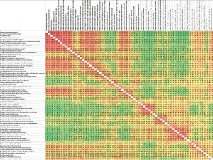
Similarity Matrix
This looks really confusing to start with, but is a very effective way of displaying the information. Essentially it shows how often two tasks are grouped together. The redder the box, the more it has been grouped together. For us as designers and developers, it helps us determine what people will look for in similar locations, so we can implement designs that cater for that desire.
What’s next?
The study hasn’t quite completed yet as we want to give as many people as want to respond, the chance to do so. However we’re already starting to analyse what is coming in and design some early concepts.
In the coming weeks we’ll be releasing some posts where we look at these early concepts for parts of the site, based on this feedback, so you can see how we’re using data to give people what they want.

[…] top task research identified key tasks relating to course pages. This research (along with design sprints performed […]